Eye Tracking Architecture: a Pilot Study at the IHCD

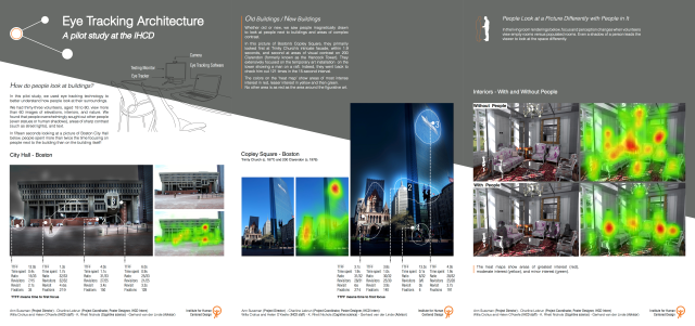
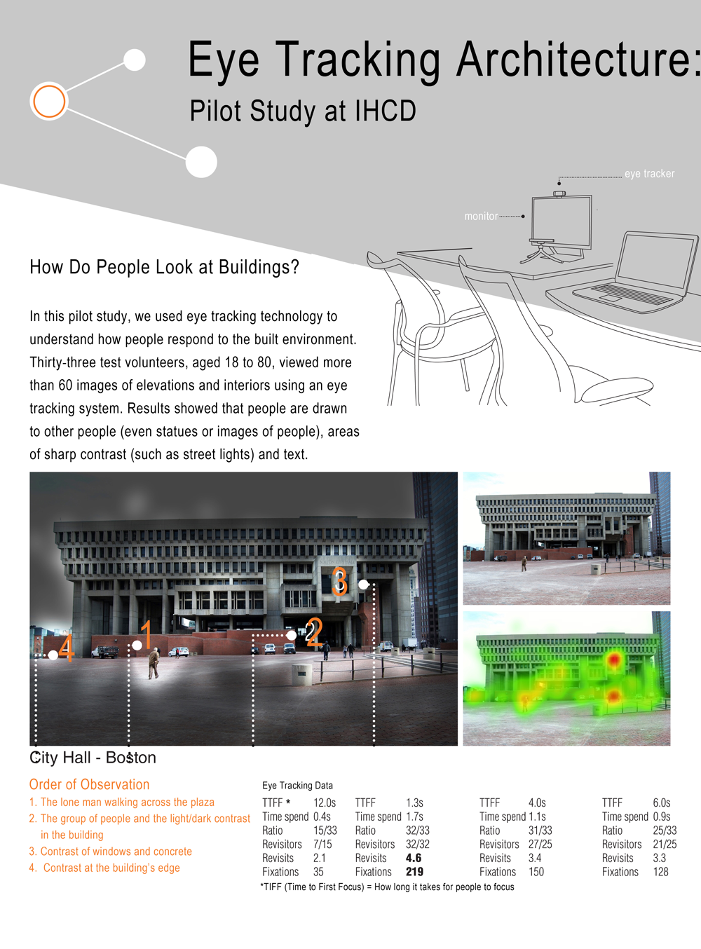
In our pilot study at the Institute for Human Centered Design (IHCD), we used eye-tracking technology to understand how people respond to the built environment. Thirty-three test volunteers, aged 18 to 80, viewed more than 60 images of elevations and interiors using an eye-tracking system. Results showed that people are drawn to other people (even statues or images of people), areas of sharp contrast (such as street lights), and text. An overview of the study is summarized in the poster below and enlargements of the poster, provided for readability, follow.

POSTER-x

Section 1 introduces the pilot study and shows results from eye tracking Boston City Hall.

Eye Tracking Poster, Section 1

Eye Tracking Pilot Poster, Section 1

Section 2 shows results from eye tracking Boston’s Copley Square.

Eye Tracking Study Poster, Section 2

Eye Tracking Pilot Poster, Section 2

Section 3 shows results from eye tracking an interior space.page3

Posted in Architecture, City Planning, Design, People-centric Design | Tagged | 5 Comments

Putting Faces First

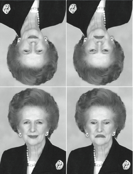
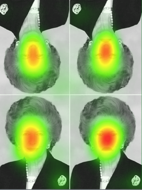
After eye tracking a photo of the young man below, we saw how compelling a face could be. Within 3/10 of a second, the 33 people in our pilot study focused on his eyes and mouth. They proceeded to go back and look at these features 666 times in the 15-second testing interval. The ‘heat map’ below reveals the trail their eyes made, glowing reddest where they looked most.

boy-heatmap.png

This facial bias, which is hard-wired in us, is not lost on product designers. Car makers are familiar with it, knowing that a majority of their customers ‘bond’ to a car’s front end, sealing deals because of emotional attachments made to an automobile’s ‘face.’ Computer folks know it too. The graphic below cites stats from Amazon, the world’s leading bookseller today.

amazon-quote

Keen on market domination, Amazon has developed its branding around the face. You can see the impact playing out in a row of gift cards at a CVS (below left). It’s hard for Bed Bath and Beyond and other retailers to compete with Amazon’s smiley logo. It simply grabs our attention in crowded racks because it’s meant to, with Amazon smartly leveraging 3.8 billion years of our evolutionary history. They’re betting that our affinity for faces, which insured our survival over eons, can’t help but ensure theirs.

amazon.pngAlso intent on maintaining its dominance, Amazon uses a version of the smile for its logo too, in its packaging tape (above right), exploiting the science that explains when we see a smile, we unconsciously feel happy. Part of us will feel good, and readily attach and reach out for that cardboard box even before we open it—even if it’s destined for someone else!


And Amazon’s not alone in exploiting our biological heritage, as a glance at other firms’ logos reveals. Here we see that businesses as diverse as crayon manufacturers, food purveyors and radio stations use the same facial feature to snag us.

logos-with-smiles

So the next time you’re creating marketing material, flyers or websites, consider the pattern we’re not only wired to see first, but also feel happiest about.

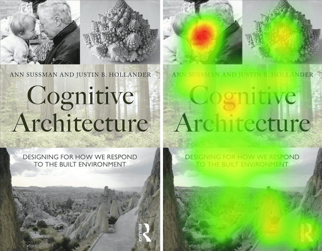
When Justin Hollander and I were thinking about cover designs for the first edition of our book, Cognitive Architecture (Routledge, 2015), we felt a face had to be on it, even though it was a book meant for architects and planners. “No buildings,” we said, “It has to have a face.”

The cover we ended up with is below (left). We eye tracked it last year, and learned that viewers did indeed look at its faces first, going back to check them out repeatedly. The time to first fixation (TTFF) on the faces was less than a second, and our twenty-four test subjects refocused on them 361 times in a 15-second testing interval. At the end of the day, we conclude, it seems best not to try to fool Mother Nature, but rather work with the plans she’s already laid in place.

eye-tracking-book-cover-heatmap

Writer: Ann Sussman
Editor: Janice M. Ward

Posted in Uncategorized | Leave a comment

Inner Views: Your Brain on People

We see a space differently with people in the picture; our brain simply directs our attention towards them without any conscious effort on our part. On some level, we may know this, but now with eye-tracking technology we can really look at it!  And our human-centric bias is striking to behold.

See the interior rendering below (kindly provided by architect Gerhard van der Linde).

Interior Rendering: Gerhard van der LindeScreen Shot 2016-04-02 at 12.55.53 PM

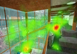
The image at left shows a double-height space with a young woman seated on a stair; to the right is a heat map of the same view, glowing red where volunteers (from our recent eye-tracking study) looked first and foremost. Given a 15-second interval, they took in the woman’s face in less than three seconds on average and spent more time going back to check her out than looking anywhere else—despite all the other details, vegetation, and elements present.

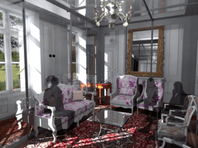
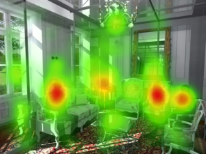
Even when people are merely suggested, appearing as shadowy shapes as shown below, our brain directs our eyes to focus on people or things resembling them.

Living Room with Shadows of PeopleLiving Room With Shadows of People


In these interior renderings, provided by designer Charline LeBrun, three smokey figures sit on a living room sofa and chairs. On the right, the heat maps, from a recent eye-tracking study of 24 volunteers, glow brightest and largest around their shapes, even though there are many potential areas of interest in the scene, including outdoor views, an intricate rug, an ornate chandelier.

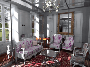
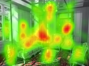
Without people, we take in the same scene much differently and more randomly, (see  images below). The eyes move about more, drawn to areas of sharp contrast, such as where light and shadow are juxtaposed in the image center, or where there is a bright chandelier reflected in a mirror just to the right of the image center. Note how there are 10 or so areas that glow reddish in this image versus a mere four in the one above.

Interior Living Room Without PeopleLiving Room Without People Heatmap

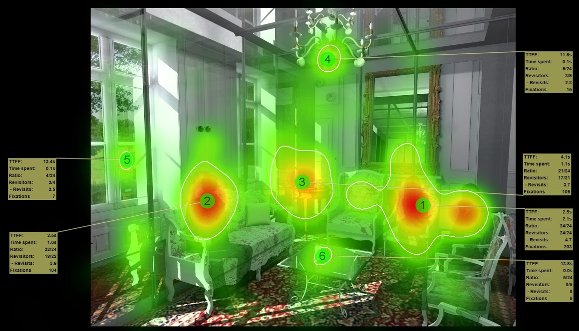
More detailed analysis reveals just how astonishingly different our viewing patterns become with people around (see image below). With no one present, we head right for the central area, where there’s a great deal of visual contrast; (TTFF or Time To First Focus on that area is 0.4 seconds, see box at right of image). Note how over half of viewers of this scene (14/24 in this case) also found time to checkout the outdoor view within 10 seconds.

Living Room without People, Detailed Heatmap

Living Room without People, Detailed Heatmap: IHCD-Sussman

With people in the scene, however, only four of 24 test subjects found time to focus outside, and these only did so after 13.4 seconds, close to the end of the 15-second testing interval.

Living Room With Shadows of People

Living Room with Shadows of People, Detailed Heatmap: IHCD-Sussman

No wonder savvy marketers and designers plaster people all over their ads and sites. Fact is, when it comes to viewing certain classes of objects, we’re simply animals – and our brain wouldn’t – or couldn’t – have it any other way. (So much for free will!

___________

Thanks to Boston’s Institute for Human Centered Design (humancentereddesign.org) for generously providing the lab space and expert staff to help run these studies.

Posted in Architecture, Design, Uncategorized | Leave a comment

Bostonians may be hard-wired to hate City Hall Plaza

The Boston Globe took note of our eye-tracking study this Sunday in an IDEAS article. Follow this link or read the article below.

Boston Globe

The design of Boston City Hall is a charged topic. Some people love it, others hate it, and for those who fall into the latter category, local architect Ann Sussman thinks she knows why.

“Biologists describe people as wall-hugging, which explains why they avoid City Hall Plaza,” says Sussman, author of the book “Cognitive Architecture” and a resident of Concord. “The edges are too hard [to find], and your subconscious, which is guiding you, says don’t go there.”

The idea that we have hard-wired biological responses to the built environment is increasingly popular. Architects hope that by figuring out how to measure and decode these responses, they can learn to design buildings that function better and more effectively flatter our ingrown aesthetic sensibilities.

“The body is constantly communicating in ways we’re not fully understanding right now,” says Mark Collins,codirector of the Columbia University GSAPP Cloud Lab. “What everybody is interested in is tapping into the senses and getting this incredibly rich, detailed, but sometimes incomprehensible signal that comes out.”

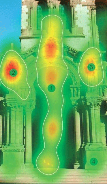
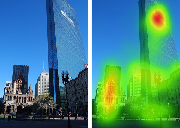
At the moment, architects and their neuroscientist collaborators have a few “biosensing” techniques they can use to evaluate how people react to places. These include measuring galvanic skin response, monitoring brain waves with an EEG, and eye-tracking, in which a wearable device lets researchers record how people’s eyes move around a space. Sussman recently conducted one such study, a small-scale experiment in which she and her collaborators at Boston’s Institute of Human-Centered Design had 33 volunteers look at a computer monitor outfitted with an eye-tracker as it displayed images of iconic Boston places like Trinity Church, City Hall, and Copley Square. Based on the eye-tracking data, the team created heat maps of the images, which glow brighter in places where people look the most and settle their gazes.

Trinity Church, Heat Map

A heat map image of Trinity Church            IHCD-SUSSMAN

The results were not altogether surprising. People tended to fixate on areas of high contrast, like a doorway, and on other people (especially faces), like the portrait of Mayor John Collins on the side of City Hall and a pair of statues flanking the entrance to Trinity Church. Participants were also attracted to a black and white vinyl mural of a man on a raft installed last fall between the 44th and 50th floors of 200 Clarendon St.

“You can see how Boston Properties would be interested [in this kind of work]. It was smart to put up the art installation. It was one area where people looked most whether they consciously intended to or not,” Sussman says.

It’s tantalizing to think that we might be able to figure out exactly what people like in a building. Marketers, after all, have been deploying similar approaches for years to better capture consumers’ attention. But experts in the field caution that it still has a long way to go to become useful.

“I would like to see the enthusiasm for these new tools tempered just a little because my fear is that they won’t live up to their early promise if we over interpret the findings,” says Colin Ellard, a neuroscientist and design consultant at the University of Waterloo.

So far, researchers have experimented with a few different applications. A pilot project out of the GSAPP Cloud Lab at Columbia recently used eye-tracking to investigate how best to historically preserve the Nakagin Capsule Tower in Tokyo. The aim was to identify the features of the building architects really focused on in order to prioritize interior and exterior elements for preservation. Another study, run by Ellard, monitored how people react to the plain exteriors of warehouses. The idea was to assess whether a few simple design flourishes could go a long way to boosting the visual appeal of the facades. Ellard found evidence that might be the case.

“One of the things we know for sure is the visual complexity of a facade has an effect on people’s emotional reaction to it,” he says. “Eye-tracking might be able to tell us whether those subtleties in a facade do capture people’s attention, whether they have a mitigating effect on the general story that low facade complexity is not a good thing.”

All of these insights might have been arrived at through intuition, or even by way of less sophisticated forms of technology. For now, biosensing is an intriguing but still limited tool in architecture — one that can be used as a cudgel in arguments about the design of City Hall, but which one day might help architects design buildings more in tune with the people who will use them.

Kevin Hartnett is a writer in South Carolina. He can be reached at kshartnett18@gmail.com.


Posted in Uncategorized | Leave a comment

How We Look at Buildings

When we look at buildings, what do we see first? What attracts us most? What grabs our attention?

Last month, we began a pilot study exploring these questions at Boston’s Institute of Human Centered Design (IHCD) using an off-the-shelf ‘eye-tracker’ combined with data analysis software.

Eye tracking technology lets you see how people look at their world and records where they unconsciously focus. Product designers and marketers already use this and other bio-sensing or monitoring tools to find out which products consumers will likely buy based on their viewing preferences.

In our preliminary study, more than 30 volunteers looked at over 60 images of the built environment. What would our eyes be naturally drawn to without conscious control?

Eye-Tracking Test Environment

Eye-Tracking Test Environment at IHCD
[photo by: IHCD-Sussman]

 This photo shows the eye-tracking test environment at IHCD. The study volunteer (on the left) views photos on her monitor while an IHCD staff member watches the test computer with eye-tracking analysis software installed.

Below are a few of the test results from Copley Place, one of Boston’s famed public spaces. The photos show Trinity Church (1877, by HH Richardson), a famed Romanesque building next to IM Pei’s landmark skyscraper, today called 200 Clarendon (formerly the Hancock Tower) built in 1976.

The ‘heat maps’ glow bright red where volunteers looked the most and fade to green where they looked less.

Copley Place Boston

Copley Place Boston and Eye-tracking Results  [photos by: IHCD-Sussman]

The images suggest that people are really drawn to:

  • Other people including the art installation of a man on a raft on the 200 Clarendon Tower, and
  • Areas of contrast, such as the front elevation of Trinity Church.

The following ‘spotlight’ image, in black and white, shows the same thing as the ‘heat map’ with bright areas indicating intensity of interest.

Copley Place Boston

Copley Place Spotlight Image with Data [photo by: IHCD-Sussman]

The data term TTFF means Time to First Fixation; it shows how people tended to look at nineteenth century Trinity Church first, and the mid-20th-century Hancock Tower second and third. They then fixated on the tower’s art installation 191 times in the 15-second viewing interval, going back to look at it on average close to four times!

Our study’s preliminary conclusion?  People love looking at people, not unlike what architect Jan Gehl is famous for saying, quoting 1000-year-old ancient Norse poetry, “Man’s greatest joy is man.”  Given that we’re a social species, it does stand to reason.

Stay tuned for more data and photos – coming soon!

Ann
Editor: Janice M. Ward

_________

Thanks to Boston’s Institute for Human Centered Design (humancentereddesign.org) for generously providing the lab space and expert staff to help run these studies.


Posted in Uncategorized | Leave a comment

Faces of Japan

Have you ever looked at a house and felt it was looking back? Did the windows, doors and threshold resemble a friendly face? Now that I’m attuned to our subconscious bias for faces, I’m on constant lookout for buildings that suggest a face or face-i-tecture. A recent trip to Japan highlighted just how much our brains recognize face-like designs on buildings and streetscapes to help us feel at home.

Shrine Near Mount Fuji

Shrine at the top of Mount Komagatake, an observation point for Mount Fuji

The Hakone Shrine Mototsumiya smiles down from the top of Mount Komagatake which offers magnificent views of Mount Fuji. Visitors reach the top via a 1,800 meter aerial tramway in Hakone National Park. Although this shrine was built in 1964, the Japanese have a long history of building temples with a similar visage. It’s amazing how this powerful building welcomes visitors—transcending language and cultural barriers.

Todaji Temple in Nara Park

Todaji Temple, Built in the Nara period (710-794AD) for the Emperor Shomu

About 200 miles west of Mt Fuji, a much older temple in Nara Park offers a similar welcome on a grander scale. You can almost tell from its look that Todaji Temple is a place of prayer and peace. As a center for Buddhist doctrinal research, many visitors come to practice meditation techniques as the way toward enlightenment.

This temple was damaged and repaired over the centuries, and the current building ranks as the largest wooden structure in the world. Perhaps face-i-tecture in a building, making it seem more human and easier to connect with, makes the community more interested in repairing and rebuilding over the centuries.

Traveling southwest toward Kyoto, I found smaller buildings with similar expressive facades, such as the ones below. Kyoto is the center of Japan’s cultural, spiritual and artistic heritage with more than 2,000 temples and shrines including 17 that are UNESCO World Heritage Sites.

Japanese Hall near Kyoto

Small Japanese Hall with Pleasing Facial Expression at Ryoanji outside Kyoto

Japanese Pagoda

Pagoda near Kiyomizu Temple in Kyoto shows Chinese Architectural Influence and Smiling Face

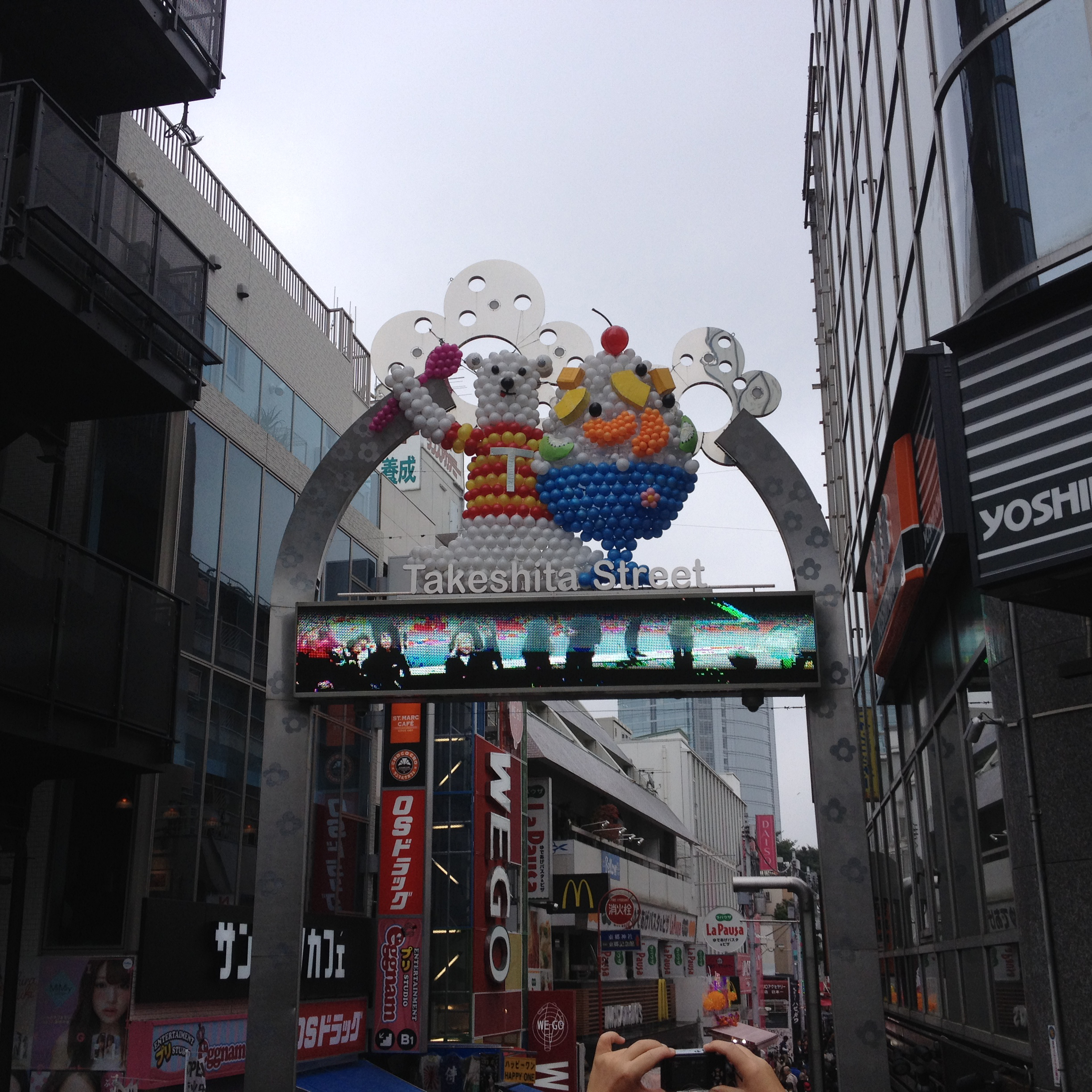
Though face-i-tecture is missing from high rises in modern Japanese cities, that does not diminish our need to see and be seen by faces. In new construction, it seems that local builders, designers and marketers sensing our face bias, install statues, cartoons and other facial animations to keep people subconsciously engaged in the modern streetscapes. For example, in the shopping area favored by teens in Tokyo (below), notice the animal statue and visual billboard that videos and broadcasts shoppers’ visages as they walk toward the stores.

akeshita Street in Tokyo

Statues and Digital Billboard on Takeshita Street in Tokyo

Opposite Tokeshita Street, anime billboards designed as instructional devices for teens use anime to warn about the dangers of sharing passwords on digital devices.

Anime Billboard

Anime Billboard outside Harajuku Station opposite Tokeshita Street Shopping District

Meanwhile at GinzaWorld in downtown Tokyo, the face of “Hello Kitty” greets customers outside the Sanrio store. According to our Japanese Guide, women who work in offices often buy Hello Kitty stuffed animals for their desks—putting a fun face on worktime.

Hello Kitty in Tokyo

“Hello Kitty” greets customers outside the Sanrio Store in Tokyo

Now that’s face-i-tecture par excellence, helping us connect to our surroundings and feel more at home wherever we are, whatever language we speak.

Writer: Janice M. Ward
Editor: Ann Sussman

Posted in Architecture, Patterns, People-centric Design | Tagged , , | 1 Comment

The Joy of Modern Houses

The first time I toured a modern house, it was love at first sight. Heart racing. Pulse pounding. Face flushing. Love. Or maybe lust. Either way, once I met a house with cathedral ceilings, I never went back. Humongous windows. Outstanding views. Asymmetric layout. Open floor plan. Sleek styling.

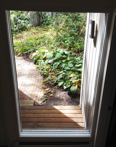
Modern House Entry

Modern House Entry, Photo: J. M. Ward

The year was 1975; rock and disco were duking it out on the radio, and computers were not yet mainstream when I first viewed that modern house. Picture the scene in slow-mo. Our heroine turns the stainless handle, carefully opens the mahogany door and catches her breath as she walks into an airy delight with a two-story teal accent wall beside transparent stairs that ascend to heaven. Enormous skylights. Unrestricted space. Light-filled areas. The epitome of indoor-outdoor living. Love at first sight.

Modern houses aren’t the first choice for most New Englanders, and my parents were no exception. Many Bay State homeowners fall into one of two camps: Cape Cod or Colonial. I was raised in a traditional New England home—a classic cape with gray shingles and black shutters.

Traditional Cape Cod Style House

Traditional Cape Cod Style House, Photo: J. M. Ward

Our house looked like every home a child draws in the second grade: pitched roof, rectangular body, chimney on the side, symmetric layout, mullioned windows, flag stones leading straight to the painted front door. Insert a few shrubs under those windows and voila! The front door opened to a staircase with living room on the left and dining room on the right. Visitors could walk through the living room or dining room to reach a back hall which connected a bedroom, bathroom and kitchen—a perfect square. Not hip or cool at all.

In time-honored New England fashion, my dad added on, renovated and rejiggered to make it his own. A knotty pine porch here, a combination workshop/office/playroom there. Honey maple and a penchant for bronze eagles rounded out his design. Homey, sure. But exciting? Heart pumping? Fun? I think not.

My architect friend and fellow blogger writes a lot about people liking houses that are anthropomorphic and seem to ‘call out to you,’ suggesting a face. “Since we are biologically predisposed toward faces since birth,” says Ann, “symmetrical design feel comfortable to most people. It responds to their need for fast orientation.”

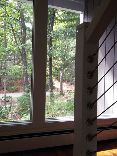
Modern House Stairway

Modern House Stairway; Photo: J.M. Ward

But I say, not so fast. We not only judge houses based on views from the outside-in; we judge houses based on the views from the inside-out. So our preferences are complex. Even though humans may prefer symmetry; they are also partial to an abundance of natural light and a connection to nature; characteristics that modernist homes display in spades.


Humans evolved with a preference for natural daylight for safety, and lately, as an antidote for depression. The older we get, the more natural light helps us with day-to-day tasks at home and at work. A recent study quoted in Science Daily, “highlights the importance of exposure to natural light to employee health and the priority architectural designs of office environments should place on natural daylight exposure.”

Modern House Porch

Modern House Porch; Photo: J.M. Ward

Researchers tell us that early humans looked to trees for sanctuary and protection long before they built huts as homes. Our evolutionary biases lean toward greenery, outdoors and nature which modern houses provide with those sliding glass doors leading to decks and beyond.

As I see it, home is where the heart is—no matter how evolved the human race becomes. And my heart belongs to cantilevered rooms, casement windows, cable railing systems and sliding doors that lead down curvy paths, meander through green gardens, and take me to sunny skies.


Writer: Janice M. Ward
Editor: Ann Sussman

Posted in Architecture, Design, Health | Tagged , , , , , | 1 Comment

Architecture that Calls to Us

I was heading to the beach the other day when I saw this barn at a nearby local orchard, and I knew I’d have to stop by.

Architecture that Calls to Me

A Barn with a Face that Called to Me; Photo. A. Sussman

The barn seemed to have wide eyes that met my gaze and called out to me. So I made a mental note to leave the seaside early since it seemed I had a date!

And when I did get to the old building later, I saw that its face was prominently used to market the place!

T-Shirt with Barn Photo

T-Shirt with Front Facade of Barn with Face; Photo: A. Sussman

The farm was selling T-shirts emblazoned with the barn’s front facade plus two or three additional face-like patterns. Employees were wearing them. Clearly, I wasn’t the only one drawn in.

Then on the drive home, I saw that a local prep school had just put up this new school sign in several places around its campus.

Concord Academy Sign

Sign with Face-like Building; Photo: A. Sussman; Sign by Crosby Design

Another face to promote a place!  Whether marketing cider donuts or something lower calorie, it appears you can’t beat this pattern to grab people.  This is of course exactly what Mother Nature has intended – she’s been doing the same thing, turning animals into sensitive ‘face-i-tects’ for millions of years – and it turns out following her rules for what she intends you to look for first often carries big dividends.

Writer: Ann Sussman
Editor: Janice M. Ward

Posted in Architecture, Patterns | Tagged , , , | Leave a comment

Drives Me Crazy

Donna called at 5pm with a last-minute request, “Can you give me a lift to Bedford? I promised to have dinner with my parents and my car’s in the shop.”

“Sure” I said, not realizing that a 10-mile drive during rush hour takes 45 minutes each way.

Not only was Donna’s car in the shop; husband Glen was driving his car home from a business trip; and daughter Amy needed a car to move into her new dorm. That’s right, three cars in a three-person household. Welcome to the burbs!

Acton Parking Lot

Parking Lot in Acton, Massachusetts, Photo: J. M. Ward

Living in Acton, Massachusetts, a small town 25 miles west of Boston, means driving—everywhere. The mass transit commuter rail takes us to Boston, but not Bedford or Burlington. The last census revealed that Acton residents own 1.8 cars per household. We have to. Nothing is within safe walking distance. Not even the local market. We even have to drive to the gym.

In our community, suburban living means limited public transportation, limited walkability for health and wellness, and limited socialization because of isolation. A total dependence on cars.

I blame Ike.

Fifty years ago, Dwight D. Eisenhower signed the Interstate Highway Act that created a nation dependent on automobiles. To this day, our train and bus infrastructure is weak, our sidewalks and bike paths are minimal, and we remain slaves to the auto. At what cost? Our health and wellness.

Acton Traffic

Acton Traffic, Photo: J. M. Ward

A recent study from the American College of Sports Medicine showed that Americans walk less than their counterparts in Switzerland, Australia and Japan. Their results conclude that “Low levels of physical activity are contributing to the high prevalence of adult obesity in the United States.” A subsequent story from Slate Magazine reveals “How We Got Off the Pedestrian Path” in The Crisis in American Walking. “Walking has been engineered out of existence,” cites Tom Vanderbilt, mainly because of the car.

The chart below comes from the American Public Health Association (APHA) website which compares Americans’ health with other high-income nations.
In life expectancy, we rank 34th!

American Public Health Association

Chart from the American Public Health Association (APHA) at http://www.alpha.org/HealthiestNation

After 50 years of highway driving, do we even know how much walking would put us on the right path? The New York Times revisits “how many steps a day we should really walk?” Given the state of American health, the common benchmark of 10,000 steps per day may be too low. At 2,000 steps per mile; 10,000 steps or five miles per day might not be enough. And we are missing a prime component—infrastructure. Sidewalks and bike paths fell by the wayside when the car became king, and our health has suffered from it.

What if we labeled unwalkable neighborhoods like we do cigarettes?” suggests Smart Growth America, a website dedicated to promoting walking and physical activity as a built-in feature of communities.

This week, the Surgeon General of the United States answered the call by kicking off a campaign called, Step It Up! The Surgeon General’s Call to Action to Promote Walking and Walkable Communities. The Step It Up! website includes additional resources such as tips on How to Start a Walking Program and an easy way to add a little music to our walks with the Surgeon General’s Walking Playlist Exit disclaimer icon on Pandora.

Surgeon General's Step It Up Campaign

Surgeon General’s Step It Up Campaign

With over 47,000 miles of interstate highways connecting car-centric communities, how do we reverse Ike’s unintended consequence of an unhealthy nation? Let’s tell Congress to listen to the Surgeon General by making walkable communities a priority in the next transportation bill and just keep walking!

While waiting for Congress to act, Donna and I will probably still be sitting in traffic. Maybe we could walk there faster!

Empty Acton Sidewalk

Empty Acton Sidewalk beside Route 27 Traffic, Photo: J. M. Ward

Writer: Janice M. Ward
Editor: Ann Sussman

Posted in City Planning, Exercise, Health, Walkability | Tagged , , | Leave a comment

The Allure of Repeated Patterns

The main draw of the new Broad Museum slated to open in Los Angeles on September 22 is the eye-catching pattern on the building’s skin. Humans are captivated by repeating patterns: dots, diamonds, circles, cross hatches, ovals, stripes, spirals, scallops, stars, triangles, wavy lines, zig zags, and hexagons.

We doodle them during boring meetings, design them into quilts, and create tile mosaics that can last for centuries. Patterns evoke emotional responses from us, mostly positive, but not always. Think about a honeycomb shape and a fear of bee stings.

The Broad Museum

The Broad Museum in LA, Photo: Iwan Baan from thebroad.org

“We have evolved to register and investigate and prefer certain forms over others in fractions of a second,” says Ann Sussman and Justin B. Hollander in their book, Cognitive Architecture: Designing for How We Respond to the Built Environment.  “In those brief moments our brain can subconsciously determine whether or not to flee or step forward well before our conscious mind gets into the act.” For our ancestors, sharp objects represented danger while curved surfaces felt safe. Pattern recognition is key to survival.

While curves represent safety over sharp pointy objects, we also like symmetry which is so similiar to the bi-lateral symmetry in faces. Symmetry also appears in repeating patterns and appeals to our desire for balance. The photo below shows the symmetrical layout and repeating patterns in the dome and wall tile at the Topkapi Palace in Instanbul.

Topkapi Palace

Dome inside the Topkapi Palace in Istanbul, Photo: J.M. Ward

Our brains find special meaning in patterns from our natural habitat. Since we evolved as hunter/gatherers on the Savanna, patterns from Mother Nature hold innate appeal.

Pattern recognition happens when we match something we see to something in our memory.  We evolved to recognize patterns as a survival characteristic to distinguish the danger of the spots on a leopard or the hexagons of a beehive in a fraction of a second.

All we need is a quick scan to verify dots on leopards, stripes on tigers, cross hatches on branches, ovals on petals, spirals on shells, triangles on hills and trees, wavy lines on sand dunes and mountain ranges, and hexagons on bee hives.

Ephesus Mosaic Floor in Terrace House

Mosaic Floor in Ephesus Terrace House (1BC to 7AD), Izmir Provence, Turkey, Photo: J. M. Ward

Instinctively, we adapt, translate and extrapolate these natural patterns into our own designs.  Think about your favorite buildings. The best designs not only rely on form; they trigger your pattern-matching skills. A key reason we like the Acropolis in Greece is because it looks like trees rising in a forest.

Acropolis

Acropolis in Greece, Photo: Wikimedia

Our admiration for Dulles Airport (designed by Eero Sarinen) in Washington is peaked by its evocative wavelike canopy that resembles the ocean or dunes.

Dulles Airport

Dulles Airport, Architect Eero Sarinen, Photo: Wikimedia

The popularity of the pyramids lie in their resemblance to mountaintops.

Louvre

Pyramid at the Louvre, Paris, architect I.M. Pei, Photo: Wikimedia

Humans evolved to recognize forms and patterns, and the most successful architecture uses both.

So the next time you find the margin of your notebook filled with dots, doodles and squiggles, don’t worry; it’s just your unconscious working overtime.

Posted in Architecture, Design, Patterns | Tagged , , , | 1 Comment