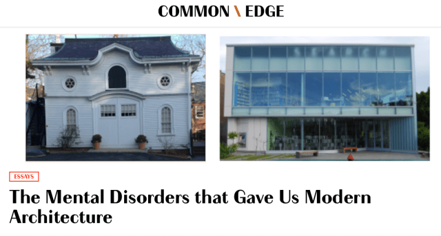
Click on images above to read this recent post on CommonEdge.org, a non-profit site dedicated to improving the design of our built environment.
The piece is co-authored by Ann Sussman and Janice M. Ward from geneticsofdesign.com.

Click on images above to read this recent post on CommonEdge.org, a non-profit site dedicated to improving the design of our built environment.
The piece is co-authored by Ann Sussman and Janice M. Ward from geneticsofdesign.com.
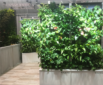
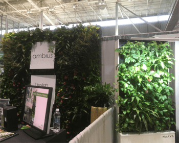
Last week’s GreenBuild/ ABX2017Expo in Boston boasted a mind-boggling 550+ exhibitors and 75+ product categories focused on sustainable building—from insulation to solar panels. As the escalator descended to the 12-acre exhibit space, I felt that Robin Williams’ Moscow on Hudson moment—completely overwhelmed by too many choices. So I dodged the crowds, blew past the booths, ditched the demonstrations. and tipped-toed past the tiny houses in favor of plants. Walls and walls of green plants. They drew me in.
In an Expo Hall overflowing with people and products, I sought out the green at GreenBuild. E.O. Wilson, the famed biologist, might understand. In 1984, he proposed the biophilia hypothesis that suggests humans have an innate tendency to seek connections with nature. More recent research links the health and wellness benefits of green plants to increased productivity in the workplace, a happier workforce and increased memory retention.
I hung out in
the greenery for a while and visited a handful of vendors who touted the health benefits of vertical green walls. First stop: Nedlaw Living Walls where their biofiltration technology uses a hydroponic system to remove pollutants from a building’s air and return cleansed air while bringing nature into the workplace to improve employee well-being.
Next came Naava whose “smart green walls” offer air purification technology in a soilless system that is monitored by sensors and artificial intelligence. The company’s goal is to create “healthier, happier, and more inspiring workplaces” with a fully-automated combination product—air purifier, humidifier and living plant wall—all in one.”
Ambius promotes standalone vertical or wall-mounted, hydroponic gardens called SageWallsä and mosaic-like systems called Sage Biotilesä that can support perennials, ground covers, annuals, vines and tropical foliage in any design configuration. Their walls improve air quality and beautify the workplace while boosting employee morale.
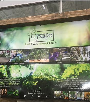
The focus of CityScapes is to enhance the built “environment through biophilic design and the power of plants.” They claim the benefits of living walls include air filtration and pollution removal as well as stress reduction. Loved the fact their conference swag included an air plant in a tiny, round copper wire cage.
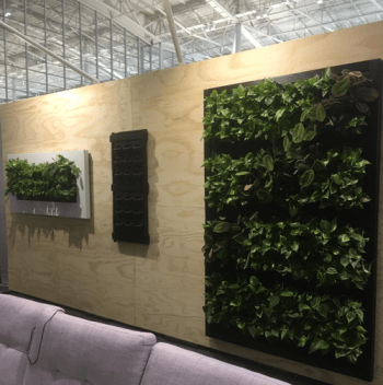
Suite Plants had my number: an easy-to-maintain modular green wall that can be mounted as easily as a photo on a wall, configured to any size and required no electricity or water pumps. The possibility of an easy-to-install small green wall in my home office appealed to my DIY nature.
If green walls can remove conference stress, imagine what they could do for an office, school, hospital or the building you’re in right now?
Turns out our man-made architecture works best when non-built features abound. At the end of the day, no matter the architect, it’s Mother Nature’s work we crave–as the experience of a 12-acre (4.8 hectare) exhibit space made clear.
Imagine the impact in a smaller venue–like my home office!

(All photos by Janice M. Ward at GreenBuild 2017 in Boston.)

What makes a place walkable? Turns out it’s not just sidewalks. ‘Fixation points’ that stimulate the eye to look in a direction or at a specific place, matter too.
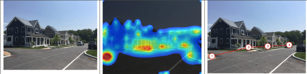
With eye-tracking tools, you can start to deconstruct the hidden process behind walkability, looking at how how we ‘fixate’ without conscious control, and then move our attention and/or our bodies towards the place in question. We can track the visual sequence our brain gets our eyes to follow as they look at something, as shown in the streetscape above, (at right).
This is Chance Street, a new neighborhood in Devens, central Massachusetts, designed to promote community and rehabilitate a former military base. Working with a team at Tufts, we eye tracked the new development using an off-the-shelf emulation product, 3M’s Visual Attention Software (VAS). The central image which it created shows a ‘heat map’ that glows brightest where people likely look most within the first 5 seconds taking in this scene (during ‘pre-attentive’ processing). The image at right above, shows the path eyes likely follow within that timeframe. The fixation sequence shown here, 1 through 4, goes straight down the street, suggesting both the building layout and architecture promote walkability as intended – even before our conscious brain can get into the act.
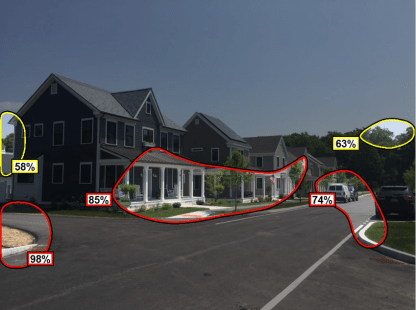
Eye-tracking data can also be compiled into ‘regions’, where outlined areas in red (in image at left) indicate a high probability of garnering viewing attention (74% – 98%), in yellow, a medium probability (58% – 63%). Areas with no outline will most likely be ignored.
So, here again, you can see that even if you’ve never been to Devens, you’ll have a pretty easy time navigating along Chance Street.
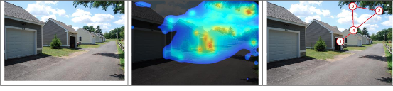
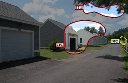
The biometric testing suggests that not all areas of the new development invite walkability to the same extent, however. For instance, the parking alley behind Chance Street, lined with free-standing garages, would prove much more daunting for the newcomer who would be less likely to even consider ambling along it. Why?
The images above show how the brain directs the eyes to take in the central area of the scene but provides no clear path of fixation points down the roadway – so nowhere to go from the unconscious brain’s perspective; and because unconscious processing directs conscious behavior, this is not going to be a popular pedestrian byway – ever. But come to think of it, that may be exactly what the developer and residents want: a street out front with people and one behind – for privacy’s sake – without them.

_ _ _ _ _ _ _ _ _
Thanks to Prof Justin B Hollander, of Tufts, Hanna Carr, Tufts, ’20, for assistance with research and the Devens Enterprise Commission for supporting it.

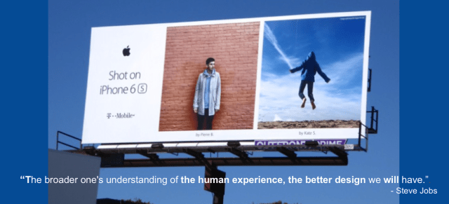
If you want to learn how your brain works, in particular how it takes in visual stimuli, look at an Apple ad.
The tech giant, listed as the world’s 9th largest company, with a current valuation of some $800 billion, has introduced revolutionary products since the ’70s. Less celebrated is how its success is rooted in computer science and consistently, dare we say it, reverential respect for and application of neuroscience. Apple studies the human brain, and more than any other tech company we know, designs its products to fit our hidden proclivities, particularly the innate animal ones we may not realize we have.
Above is a recent iPad ad that caught my eye; I don’t own an iPad and am not interested in doing so, yet the ad drew me in. How? We decided to eye track it with off-the-shelf software that tracks pre-attentive processing, or the first 3 to 5 seconds you look at something – that’s well before your conscious brain can get into the act.

Ah-hah! We found-out fast that the iPad ad masterfully manipulates our pre-attentive algorithms, feeding the brain just what it’s built to see, in the way that’s easiest for it to take in. Above is a ‘heat map’ which glows brightest where we look most, fading to blue and then grey in areas ignored. We see how the colorful contrasting ‘dots’ (perhaps they’re stars or planets) on the iPad screen in the original ad are far from randomly selected: they hook us magnetically, then our attention shifts to the text and then back again to the new product’s screen. The predicted visual sequence within the first-5-seconds is diagrammed below, starting first in the area of pinkish dots and then, appropriately enough, ending right back there. Of course the dots’ reddish hue is far from randomly selected since our eyes go straight for that color, in particular favoring red-green contrasts which the ad – surprise! – also provides. 
Eye-tracking studies outline regions of an image to summarize where attention will likely fall. And the diagram below statistically quantifies why this ad’s a keeper: some 88% of viewers are predicted to focus directly on the new product screen, with 79% taking in the product name. Not bad, considering all this likely happens without a word of instruction from the vendor within 5 seconds.
Apple, of course. sees its business as knowing people well, better than they know themselves. Steve Jobs was not at all secretive about the corporate approach either. “The broader one’s understanding of the human experience, the better design we will have,” he would say.
It’s just that most people never quite understood what he meant; he was talking about hidden processes that direct their lives and that they didn’t and still don’t know are there.

Click on images above to read this post on CommonEdge.org, a non-profit site dedicated to improving the design of our built environment.
The piece is co-authored by Ann Sussman and Katie Chen. Ann also co-authors this GoD (GeneticsofDesign) blog with Janice Ward.
Thanks to Strong Towns for also linking and writing about this post.
Thanks to ArchDaily.com for republishing this article in 2020.
We also thank Kateryna Kozlova for translating this piece into Russian and Ukrainian and posting on birdinflight.com in 2021.
Here is a YouTube video presented at ANFA (Academy of Neuroscience for Architecture) in 2020, elaborating its key points:
Here’s a question. In the photos above of two urban arcades, which one would you rather be in?
The image at left or the one at right? Don’t think too much – just choose!
In the last 24 months, I’ve had the chance to pose that same question to more than 1000 people while giving talks around the country.
And both the responses and response rates astonish. Quickly, without collaboration, everyone picks the image at right: the arcade in central Paris along the Rue de Rivoli, designed by Napoleon’s architects more than two centuries ago. (My hunch is you’d pick that too.) No one wants to be in the covered walkway in central Boston, built as part of a city court house about twenty years ago.
Here’s another preference test:
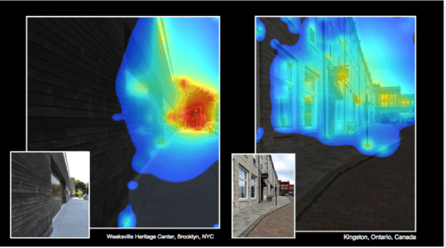
Which street would you rather walk down? Both form part of historic centers, the one on the left in Brooklyn, NYC, the other, at right, in Ontario, Canada.
I’ve shown this slide to more than 500 people. And again both responses and response rates astonish. Quickly, without collaboration, everyone picks the image at right: Market Street in the colonial port city of Kingston, Ontario. Given the choice, nobody wants to walk past recently refurbished Weeksville Heritage Center in Brooklyn, New York, an educational venue surrounding 19th-century historic homes.
How can this be? How do 500 or 1000 people so quickly make a decision about where to go, and all end up in the same place – without even speaking with each other?
The simple answer is our primate brains, hardwired to keep us safe, continuously and unconsciously scan the environment for survival. The images chosen subliminally feed the brain the stimuli needed to feel secure; the ones rejected don’t. Rue de Rivoli and Market Street give our brain what’s needed to move forward feeling at our best. The Boston Courthouse and Heritage Center in Brooklyn can’t. They never will.
Of course, how our brains select stimuli without conscious input is a larger question as is what our brains are preset to look for (some of this taken up elsewhere in this blog). Biometric studies add insight here; below is an eye-tracked version of the above street scenes created with 3M’s Visual Attention Software which indicates what gets people’s attention in pre-attentive processing (the first 3-5 seconds) taking in a scene.
The ‘heat maps’ above glow brightest where people look instinctively, fading to black in areas ignored. The results suggest one reason the Brooklyn streetscape isn’t favored is our unconscious brain won’t let us look at it. And that’s huge because unconscious brain activity always lays the foundation for conscious behavior. It guides it. We don’t readily move towards or engage with a place our pre-attentive processing has determined is to be ignored.
There are larger takeaways too, and here’s a key one: to build a sustainable future we need to build places people want to be, not places they don’t.
And this means we need to perennially pose one salient question: are we making places people will want to be – or not? And if not, why?
“I see a red door and I want it painted black”
– Mick Jagger & Keith Richards
Aside from the Rolling Stones desire to “Paint it Black,” most people are attracted to red doors. Not only is red a look-at-me color, red doors are important culturally, historically and, now, scientifically.
Both the Red Door Spa and Talbot’s clothing chains use red doors as icons to attract customers. Red doors mean good luck to the Chinese, a paid-off mortgage to the Scotts, and a source of energy to Feng Shui followers.
Traditionally, red doors have represented safe havens. The Old Testament refers to a smear of red lamb’s blood placed above a doorway to offer protection for Israelite children against a plague coming to Egypt. In early America, a red door stood for welcome, a symbol of hospitality and a place to rest. During the American Civil War, red doors were rumored as refuges for travelers along the Underground Railroad.
The color red influences our behavior, says Scientific American; everything from your behaviour in the workplace to your love life, according to a BBC report on color psychology, the study of hues on human behavior. We associate red with extremes: love and hate, life and death—red hearts, blushing faces, scarlet letters, stop signs. Red activates our appetite so much that restaurants often use it on walls, table cloths, napkins, logos, menus and advertising.
So the house with the red door in Figure 1 piqued our interest when we saw it in Dwell Magazine’s list of “10 Homes with Distinctive Facades.” Those facades purportedly make those homes memorable. And we wondered, would eye tracking support the color psychology? Does the facade or the color red make that home memorable?

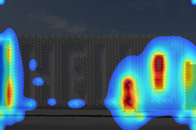
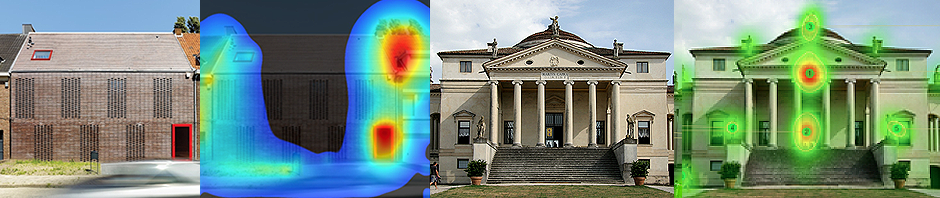
Using eye tracking software from 3M called VAS (Visual Attention Software) that predicts where people will look within the first 3 to 5 seconds of viewing a photo (before their conscious brain can react), we examined the Belgian house with the red door designed by dmvA architects. Figure 2 shows the eye tracking heat map of its façade. The red areas glow brightest where people likely look most.
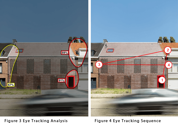
In Figure 3 the eye tracking analysis’ red outlines indicate a 92% probability of viewing attention directed at the red door, 89% at the neighbor’s red roof, and 67% at the contrasting edge of the house. The numbers in Figure 4 show the viewing sequence with the red door just where we’d expect: first.
We live “in a world dominated by images and colour. Our sense of vision largely dictates how we perceive the environment around us,” says an article in The Conversation, Making Sense of Evolution. And human vision, which is dependent on light reflection to the retina that allows us to see color, responds to red light most. The retina contains photoreceptors called cones; and about 64 % of cones respond to red light, about 33% to green light, and about 2 % to blue light. When light hits the cones, a signal is sent from the optic nerve to the visual cortex of the brain which processes the information.
The eye tracking results of the house with the red door show that only the red door was memorable because our brains (without our conscious control) look for the color red first, then the edges of the building.
So, if you want the front of your house to get noticed, don’t follow Mick’s advice. Instead, paint it red.
Last month DWELL published an article called “10 Homes with Distinctive Facades,” that immediately caught our attention. It showed pictures of ten unusual houses, explaining:
That set us wondering: how do people take in unusual buildings? How will passersby look at this architecture?

original photo: Nic Granleese
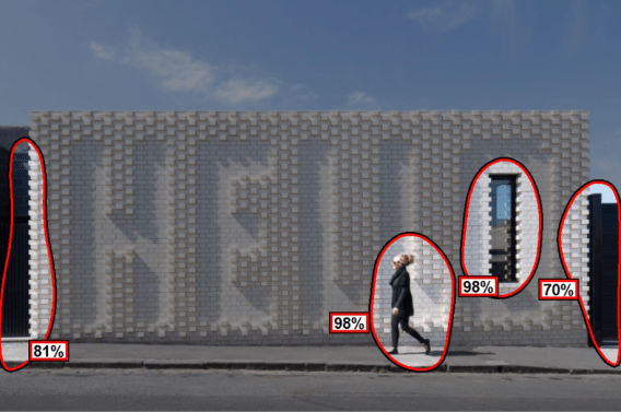
We decided to eye track the images to find out. We used the off-the-shelf eye-tracking package from 3M called VAS (Visual Attention Software), which predicts where people will look within the first 3 to 5 seconds of viewing something (or in pre-attentive processing, before their conscious brain can get into the act.)
And we learned pretty quickly that in most cases – despite their uniqueness – these buildings can’t be memorable. Why? People don’t consciously see them. Why? They can’t because their unconscious brain which always directs and precedes conscious activity – has directed their brains to look elsewhere.
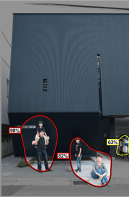
The photo above shows the eye-tracking analysis of an addition to a Victorian house in Melbourne, Australia by OOF! Architecture. Red-lined areas indicate 98% probability of viewing attention directed at the person walking by, and one window at building’s right. With the exception of high-contrast edge areas, the probability of people ignoring the rest of the building is at or close to 100 per cent! The heat map below, presenting the same information in different fashion, glows brightest where people will likely look most, fading to blue and black where they look least or not at all. And we see here, most of ‘Hello House’ is quite literally in the dark – simply not THERE, or worth looking at, from the brain’s perspective.

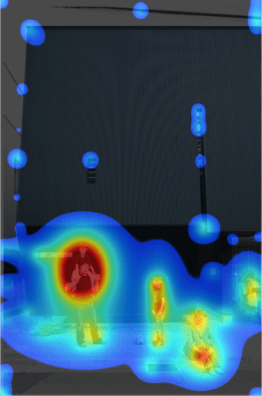
The same hold true for this unusual residence near Tokyo, Japan, by architect Russell N. Thomsen, also profiled by DWELL. Areas outlined in red indicate a 98% probability people will focus on the father and child, and 20% or less possibility they’ll look at the house behind them. The heat map also glows reddest around the family at street level, particularly around the father and child; the building itself, the software indicates is going to be again effectively ignored.


original photo: Dean Kaufman
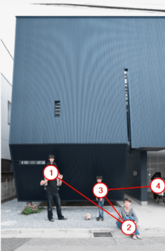
The image at left tracks the sequence the eyes will likely follow in the scene: fixating first on the father holding the son on his shoulders, then the mom seated at sidewalk, then the child between them and finally a motor bike in a parking space. Nary a focus on the building itself.
So, first impressions aren’t what you always think: what’s memorable in these images is the people out front – not the architecture; without the people it’s pretty clear our brains wouldn’t let us give these buildings a first, let alone, second glance.
article by ann + janice
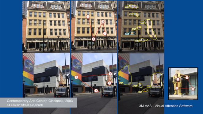
Recently in Cincinnati to speak at an AIA Vision event for young architects, I had the opportunity to eye track a local street scene. I shared my findings with the area residents later that evening. Here they are:
The photo directly above, at left, I took with my iPhone walking down Walnut Street, passing the Contemporary Arts Center, a relatively-new art museum by Zaha Hadid (2003), and then, further down the street (top photo, left), turn of the century beaux-arts office buildings. Back at the hotel I uploaded the images to eye-tracking software (3m.VAS.com) on my laptop∗ – and learned about what I’d expected: people ignore the new public art museum.
Why?
Photos in center of slide give us a clue. They show where people most likely look in ‘pre-attentive’ processing (or without conscious attention), tracking the path their eyes follow the first 3-5 seconds they take in the scene, which is before their conscious mind can get into the act. We see that viewers first focus down the street, effectively looking past the art center – fixating instead on the older buildings down the block (fixation 1, 2). They then look at the brightly colored mural at building in front of the museum, (fixation 3) and finally they settle on an orange hazard cone (fixation 4) on the sidewalk.
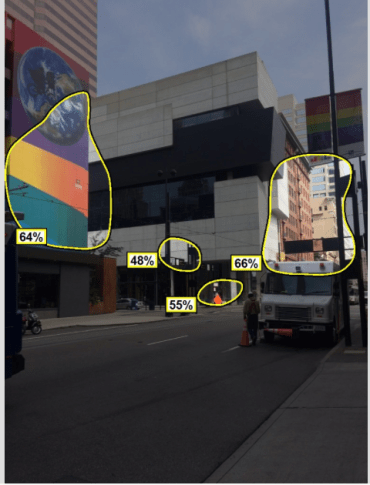
The regions outlined in yellow further delineate the areas that receive most attention and the probabilities they’ll get it; with areas not outlined of little or no interest at all.
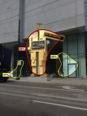
According to this analysis, there’s a 66% probability that people will look down the street, past the new art building; 64% chance they’ll look at the bright colors on the building opposite the art center – and 55% they’ll take in the sidewalk cone. The probability they’ll ignore the art museum itself is close to 100% since most of it’s in grey, falling outside the outlined regions.
What’s the problem here?
The architecture of Cincinnati’s Contemporary Arts Center simply doesn’t fit what the human brain needs or expects to see to move forward; the eye won’t and can’t find a place to fixate on the blank building – so our brain makes us look elsewhere for a place where it can. No surprise it finds fixation points on the older office buildings down the block; here, as the top row of photos in the slide above indicate, the eye easily attaches to the contrasting patterns of the punched windows and other architectural details. So that’s where our brain unconsciously directs our attention and moves us to go.
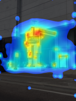
Perhaps sensing a need to bolster public appeal, Cincinnati’s Contemporary Art Center added Metrobot, a 27-foot tall robot by artist Nam June Paik, in permanent installation by its front door in 2014, a decade after opening.
And as the ‘heat map’ below indicates, glowing brighest where people look most, the sculpture does indeed grab attention, successfully directing viewers to look towards at least a part of the building their brains would otherwise have them ignore entirely.


∗ 3M VAS software can also be run directly as an app on your phone.
– by Ann with ‘seed’ idea from Janice
Does your morning commute spark joy?
Probably not, particularly if you exit the subway and face a blank wall. Add some artwork to that facade, however, and your internal joy meter will likely jump!
Check out the existing conditions in Davis Square, Somerville MA.

The picture is of the view people see when exiting the Somerville subway. The attached graph was generated by a biometric tool—facial expression analysis software—which instantly records how facial muscles move in a 14-second interval. The software produces real-time ‘joy graphs’ tracking the facial movements of people viewing the picture, specifically when people smile. In this case, the flat blue line in the graph suggests that at this stage of the commute, not that many people feel happy in Somerville.
Now check out what happens when we add a Matisse-like mural to the same facade.

We get a lot more bounce in the ‘joy’ graph, it seems denser, telling us people smiled more and really do like it when Matisse greets them instead of blank concrete.
Welcome to the ‘Age of Biology,’ as the 21st Century is now labelled (by the OECD) We live in a remarkable time where biometric tools can reliably register our shifting emotional states and when the collection of real-time data on how architecture makes people feel and behave is feasible. Talk about a paradigm shift. In today’s world if you don’t talk about human emotions and behaviors engendered by design, you are passé. 20th Century. Old-fashioned! (Measuring human behavior is where it’s at now.)
These images come from our recent biometric pilot study where we asked 24 volunteers to view photos of Somerville, MA, to learn which cityscapes people liked most. We focused on ‘joy’ over other emotions including sadness, surprise, anger, fear, disgust, and contempt, hypothesizing that joy correlates best with what people would describe as a happy experience in the urban environment.
Below are other images from our pilot-study.

The photo above shows existing conditions in Somerville’s Davis Square which people didn’t seem happy about, judging from the relatively flat joy graph. The photo below includes a bouncier joy graph when we add more Matisse-like art to the mix.

The larger blue areas on the ‘joy’ graph suggest that people felt more ‘joy’ taking in the colorful mural on the central building than with existing conditions, the blank gray wall.
Of course, to nail these findings we need to do further testing (with more volunteers and added biometric tools). Nevertheless, we think the trend is clear, and planners and architects, community leaders and developers should take note: people don’t like blank walls. They make folks unhappy. Design and rehabilitate accordingly.
And know that, with the arsenal of biometric tools expanding, we can now reliably figure out how to bring more ‘joy’ back to our cities—maybe even the morning commute.
________
Special thanks to Boston office of iMotions (imotions.com) for providing access to the state-of-the-art software and biometric study expertise.
Where The Eagles Fly . . . . Art Science Poetry Music & Ideas
Knowledge Transfer Engineering
Cool stuff in construction
The Biology behind Design that Delights
A blog by Gehl Architects
The Biology behind Design that Delights
Style Wars: classicism vs. modernism