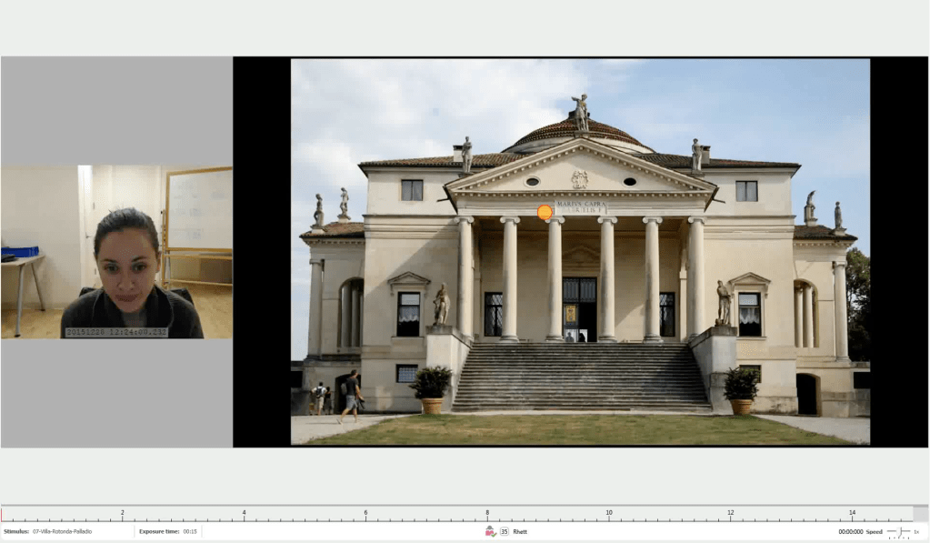
This 2025 eye-tracking study (#10) is out for analysis.
Sponsored by theHapi.org, the study looks at how humans really look at buildings, using state-of-the-art eye-tracking and facial-expression-analysis software from iMotions.com, a global purveyor of biometric tools for human behavioral research.
theHapi.org hopes to share results shortly. Feel free to reach out if you have any questions or ideas for future studies; email us at, contact@theHapi.org
You can find results of our previous biometric research here and on our other GeneticsofDesign posts:
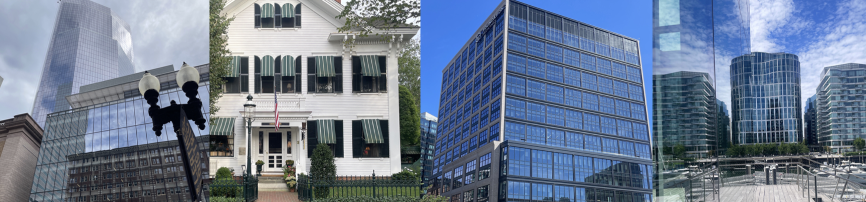
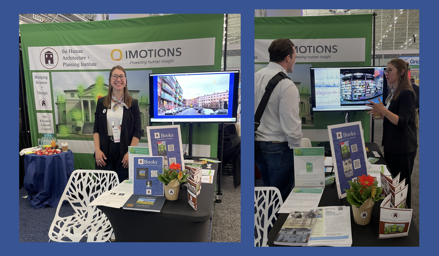
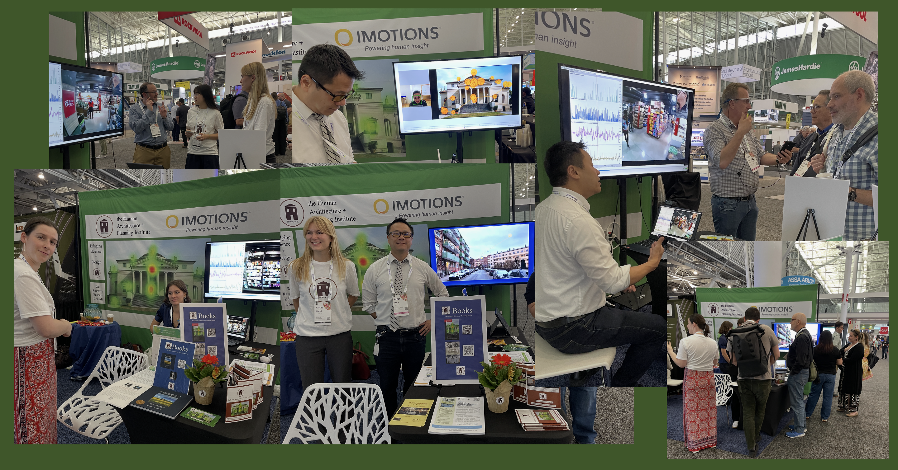
This year’s AIA Conference drew an international crowd to Boston’s Convention Center. Our nonprofit, the Human Architecture + Planning Institute (theHapi.org) was thrilled to be part of it; sharing a booth at the expo with iMotions, a global purveyor of biometric tools. Here’s pictures of the booth, #1862:
Definitely a very animated event:
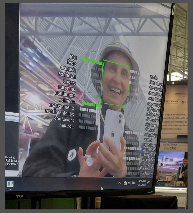
People stopped by to learn about eye tracking, which follows conscious and non-conscious eye movements and to try out facial expression analysis software, that reflects your changing expressions more quickly than one might imagine:
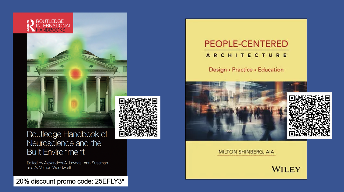
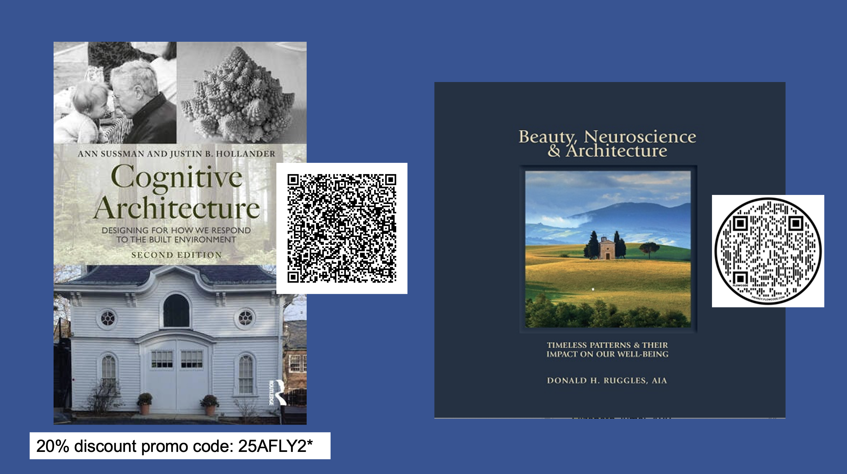
All these tools are available for designers and architects to use today to better understand the human experience of the built environment, and improve design outcomes, by doing so. That’s the mission of theHapi.org, to improve design through education and research. Books displayed at the booth promoted human-centric, biologically-aware design, included the forthcoming Handbook of Neuroscience and the Built Environment (Routledge), due out this September, and the newly published People-Centered Architecture (Wiley) by Milton Shinberg.
For more information on the books at the booth, check out QR codes (+ discount codes) below – click on the images to enlarge;
And a big thank-you to all our collaborators, Nam, Kieu, Ole from iMotions; Justin, Hazel, Agatha, Lili, Rhone-Ann, from Tufts; and theHapi Team, Abigail, Kelsey, Linda, Don and Milton – your expertise, energy + books, made this booth happen, bringing people together, making history!
How do we see buildings? This 5-minute online eye-tracking study, helping expand understanding of how we experience the built environment – is now out for analysis.
These studies use state-of-the-art software from iMotions.com, accessible on any laptop or desktop computer equipped with a webcam; on a Mac, link to it from Google Chrome or Firefox, (and it’s best to do so in a quiet space with minimal distraction.)
These studies are sponsored by theHapi.org (the Human Architecture + Planning Institute) a nonprofit dedicated to understanding the human experience of the built environment and improving its design through education and research.
Your participation helps expand our understanding of how humans experience the built environment and what we most need to see to be at our best.
And thank you for your participation; we should have results out soon.
Have ?s or need more info; email contact(at)theHapi.org
This study is now out for analysis; we’re looking to have the results and more studies up soon. Interested in understanding how humans experience the world around them? Then take part in theHapi.org‘s eye-tracking studies, all welcome!
These studies use state-of-the-art software from iMotions.com to reveal the subliminal impact of architecture that impacts human behavior and health more than most realize.
They run on any laptop or desktop computer equipped with a webcam. Participants need to be in a quiet room with minimal distractions. The studies generally take about 6 minutes in total, including 2 brief calibration videos set up to follow your eye movements.
If you have ?s or would like more info; email contact(at)theHapi.org
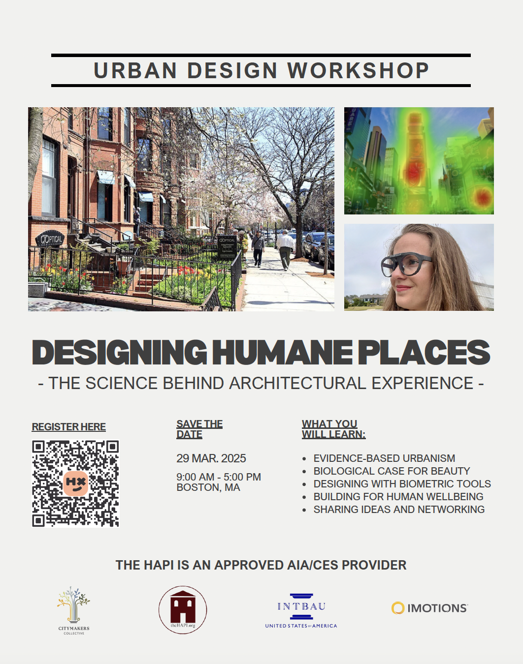
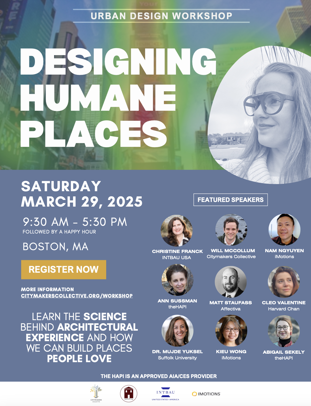
Interested in ‘seeing’ the latest science behind our experience of the built environment? Then come by to this day-long workshop in downtown Boston, Saturday, March 29th, 2025. Open to all, professionals, architects, planners, students and the public. We promise you’ll leave with new understandings not only about how architecture impacts us – but about yourself, and how to build a better future for us all.
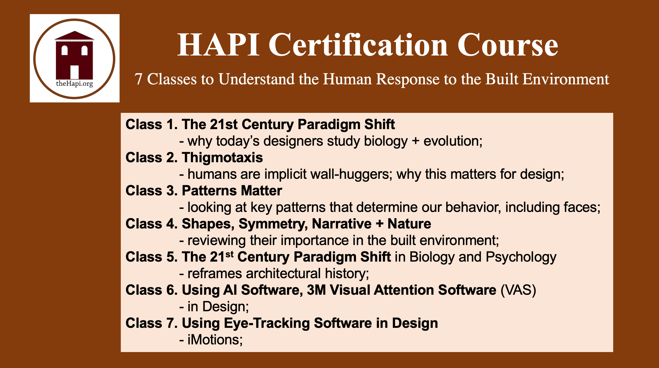
Just in time for the Holidays, we’re offering a package deal on the HAPI Certification course, all 7 classes bundled for $99!
What is it? Seven half-hour presentations bridging the arts + sciences, revealing how biology and psychology shape our experience of the built environment – inside + out, far more than most realize.
AIA-certified for 3.5 Learning Units (LUs)*, it’s the perfect gift for architects, planners, and designers of all stripes, who are keen to better understand the science behind design – and apply it.
They’ll become familiar with new tools to assess design – including eye tracking, which follows our conscious and non-conscious eye movements, capturing how we take in any scene; (click on image below).
More HAPI Certification Course information is here. Have additional ?s, email: contact(at)theHapi.org
* combined theHAPI courses provide 3 LU|HSWs credits plus 0.5 LU credit
———–
theHapi.org is a nonprofit, 501c3, whose mission is to understand the human experience of the built environment and improve its design through education + research.
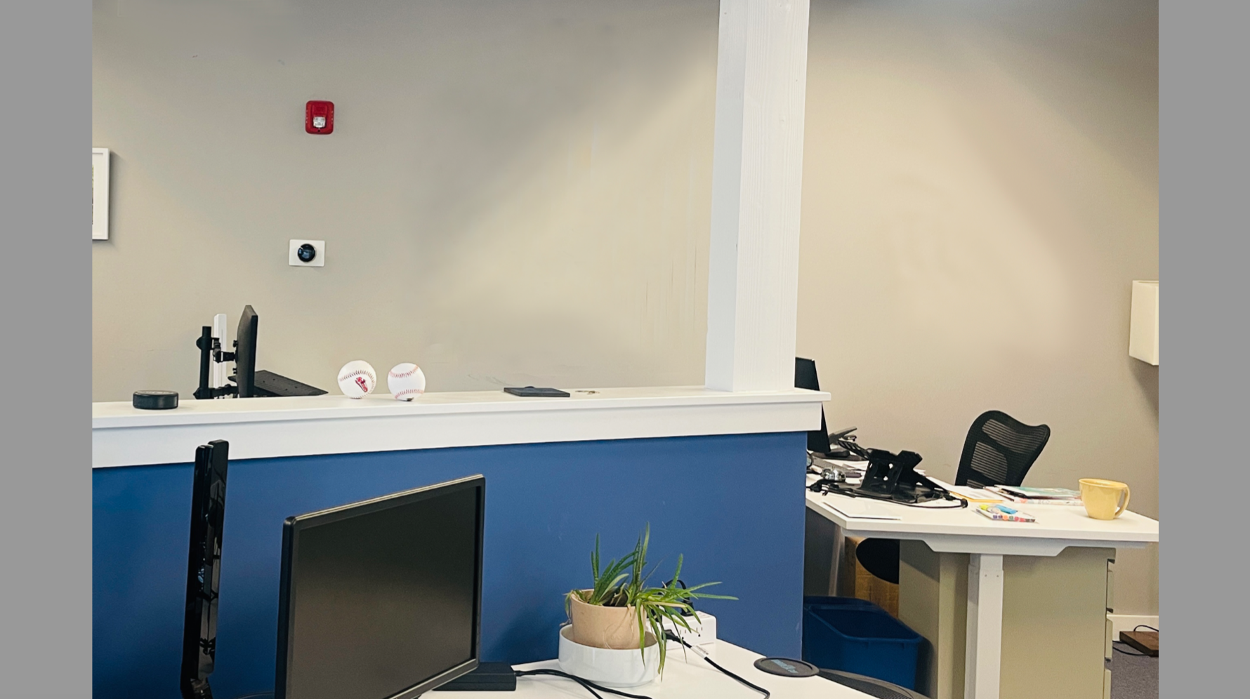
In this pilot-study, we looked at how adding biophilic art, which shows scenes of nature, changes how people see and feel about an office space. The study, sponsored by theHapi.org, used state-of-the-art eye-tracking software, to follow how people looked at a series of slides of the office with and without the art.
By assessing engagement and attention, we can measure how people interact with their environment, and importantly, also gain insights into our emotional experience, which influences wellbeing overall. This tech, visualizing the ‘unseen’, becomes an important tool for assessing the built environment and understanding what we need to see – and be in – to be at our best.
Here are some preliminary findings:
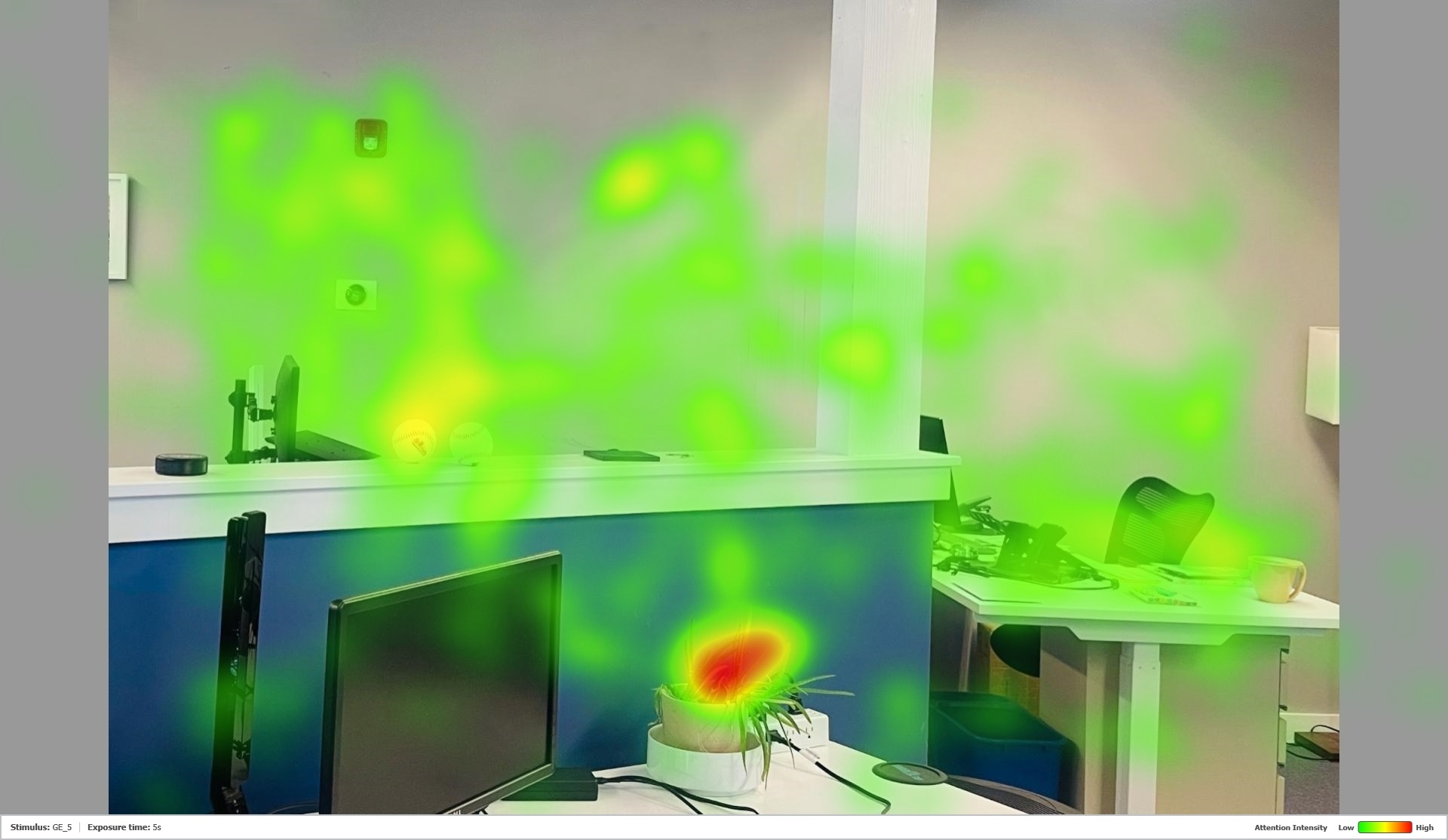
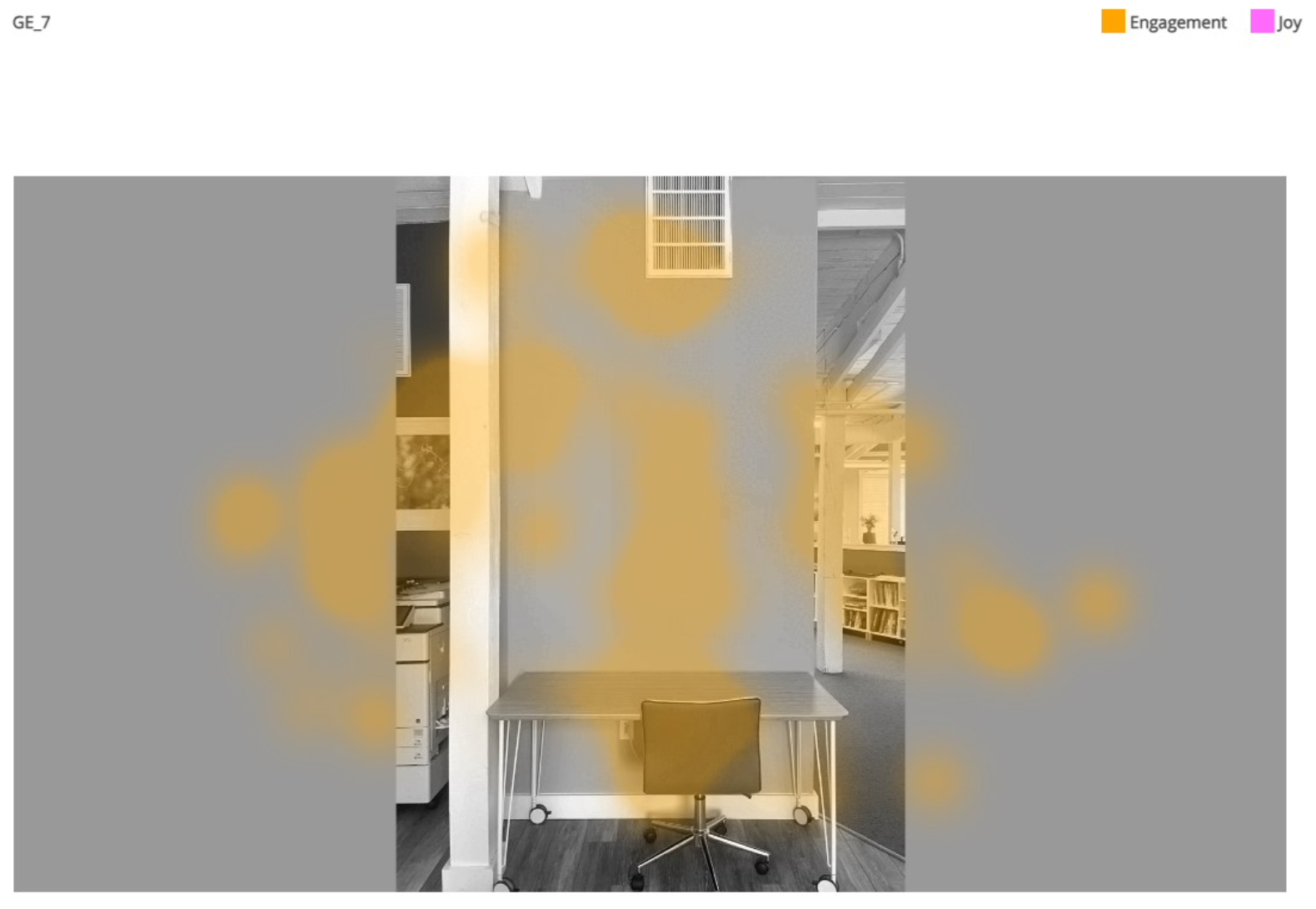
Blank walls don’t get much attention:
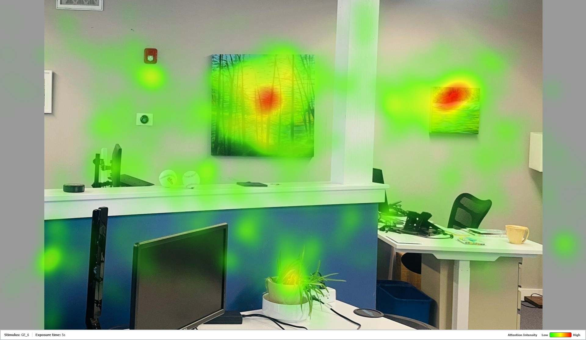
In this study, 50 participants looked at single images, like the one above, for short (7 second) intervals. In the scene here, we found that people initially focused mostly on the plant, rather than anything else in the office! Note how the heatmap, below, aggregating the eye-tracking data, glows reddest on the leaves in the image, showing where participants looked most – fading to yellow, then green, where they looked less, and displaying no overlaycolor at all in the areas ignored.
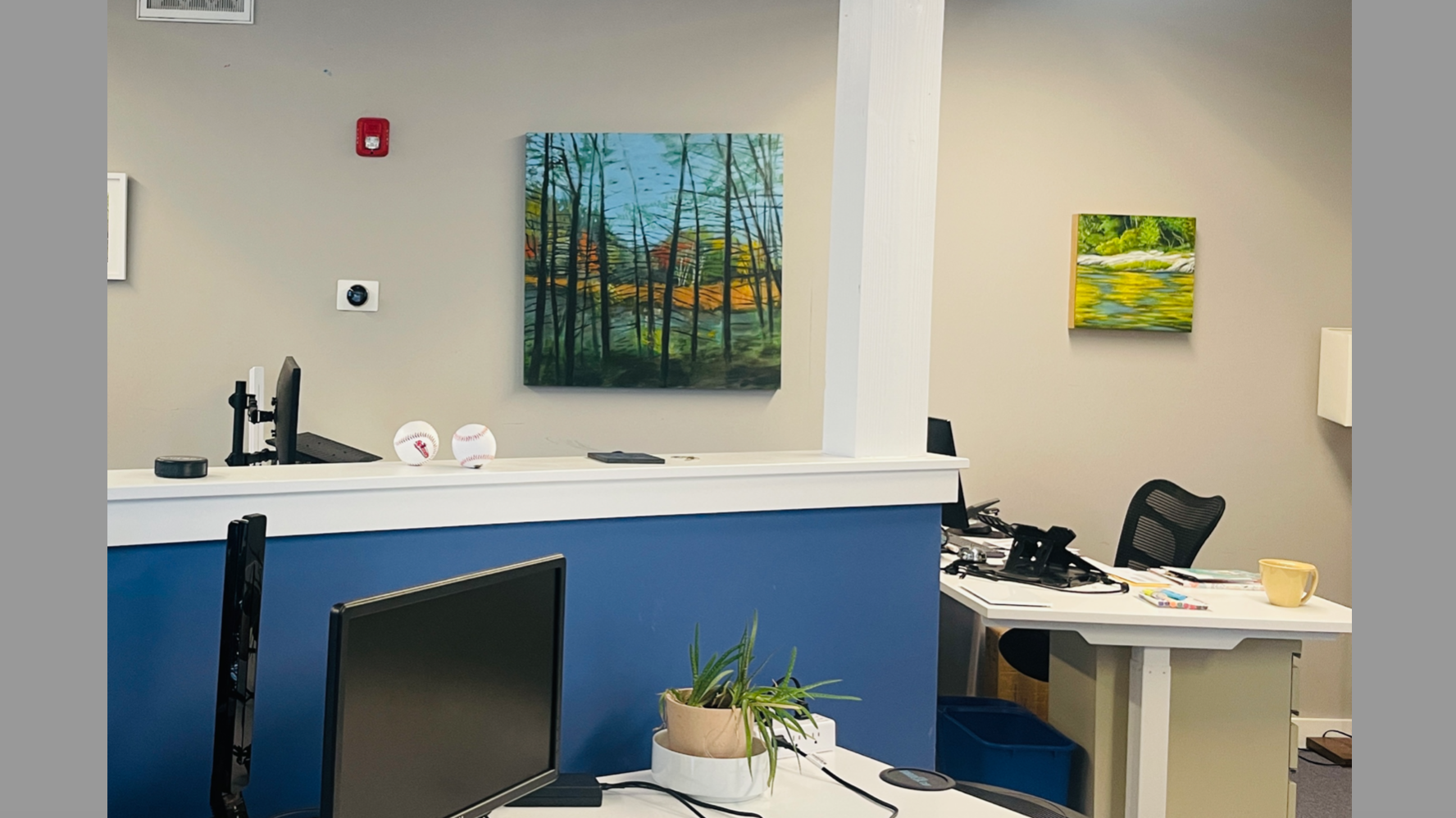
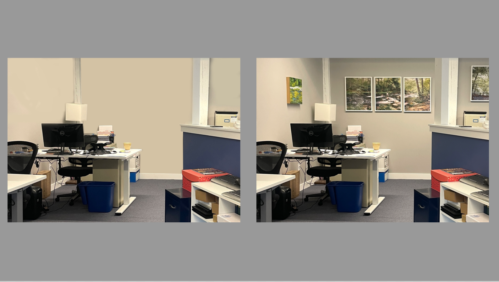
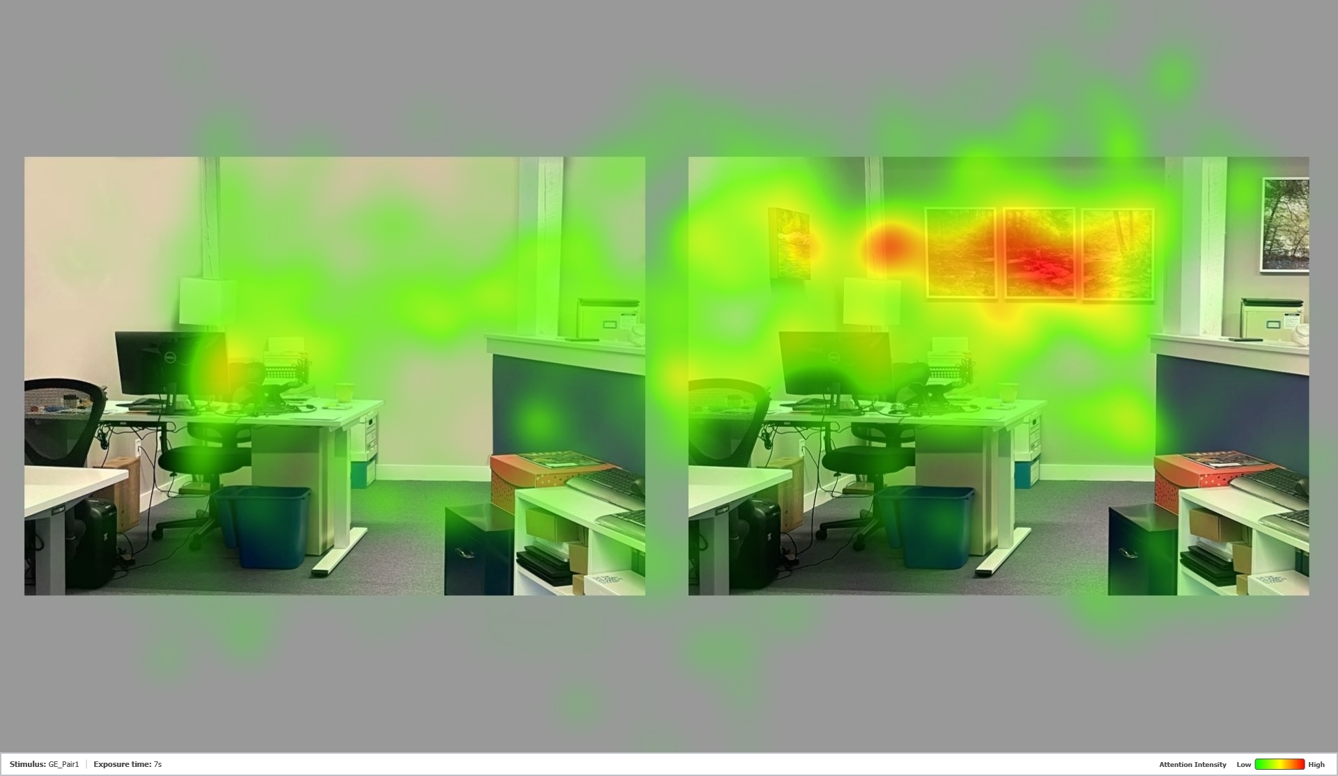
And what happens when colorful art, depicting woods and water, is added to the office?
Attention shifts; the paintings grab the views, in this case removing them away from the plant, and much of the area around the art. The visual experience seems focused and less random. (Scroll down and back up to appreciate the difference!)
Art by Irene Stapleford, center, and Lola Chaisson, right
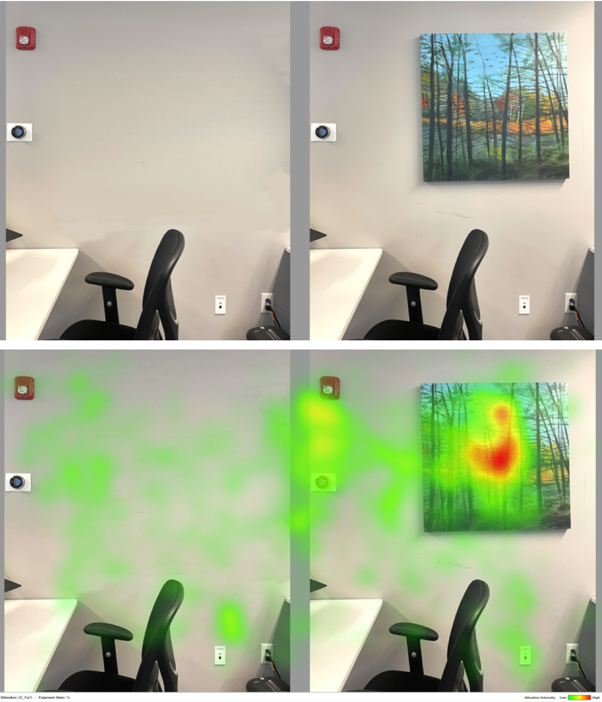
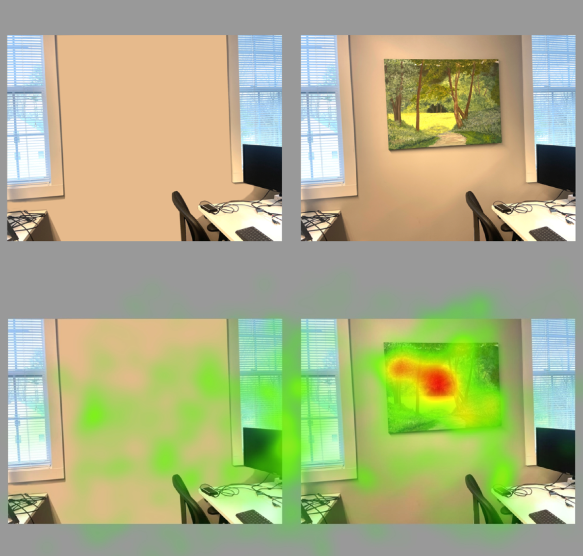
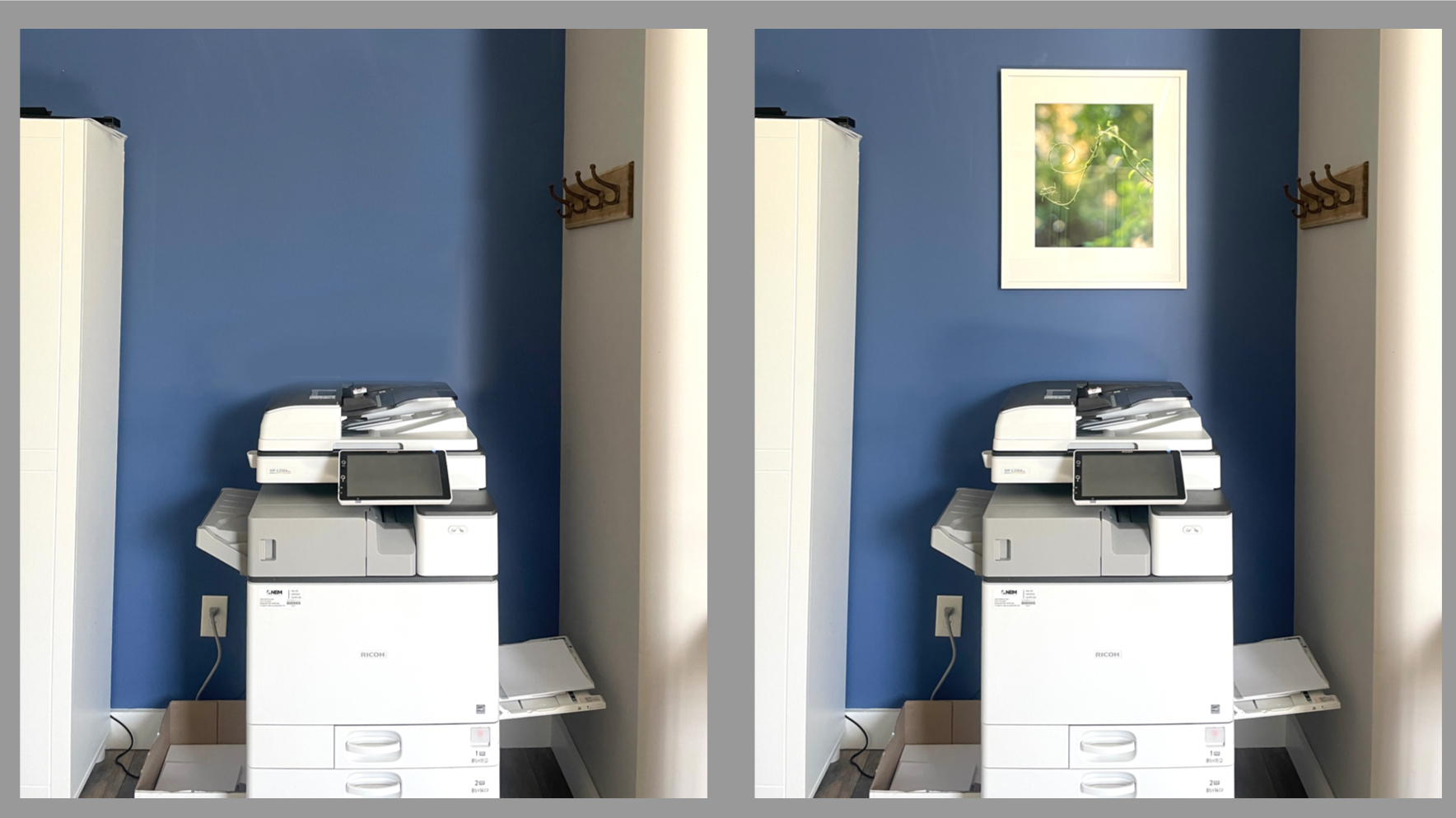
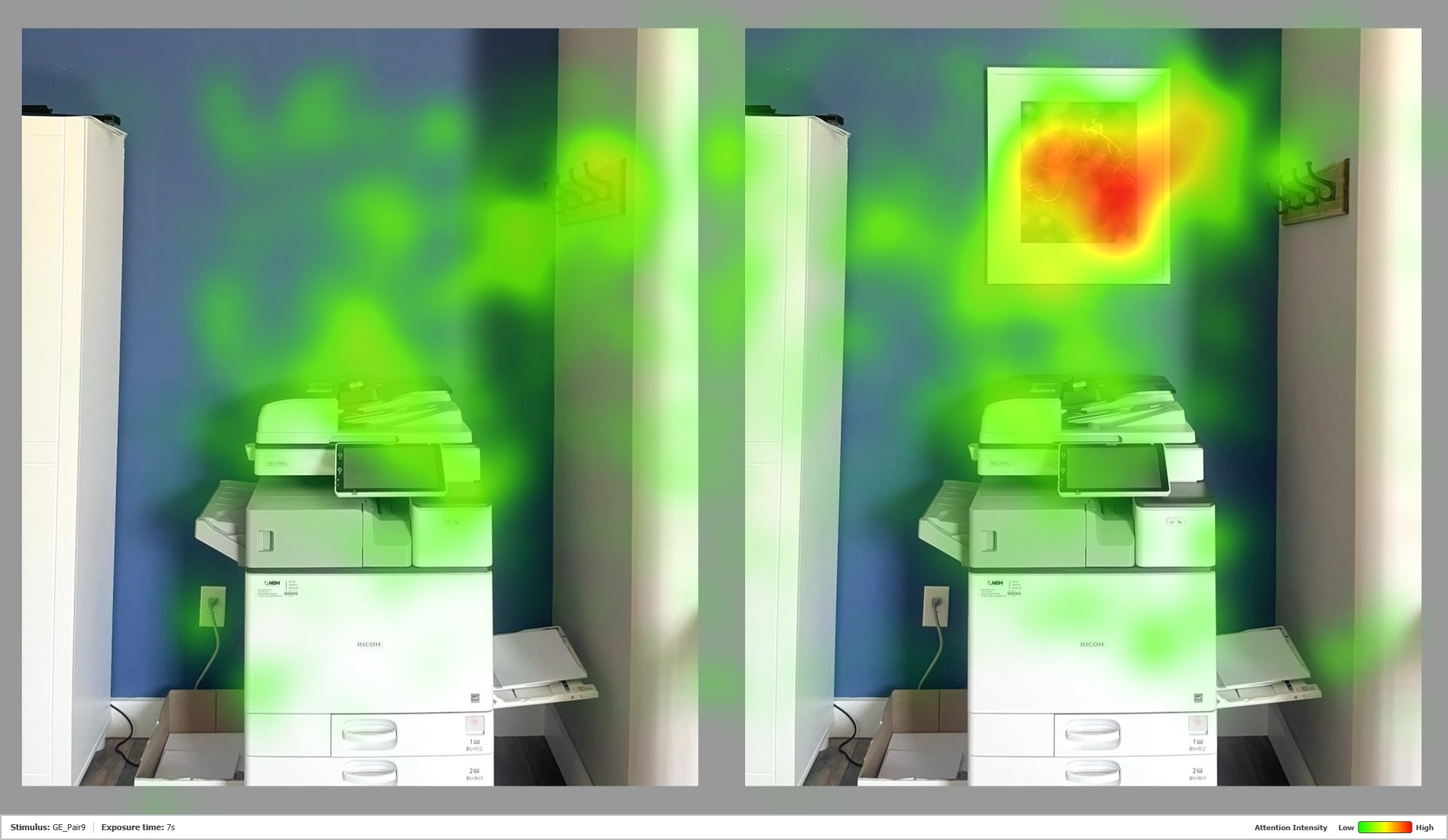
And, what happens when people look at paired images of the office, showing the before-and-after images together?
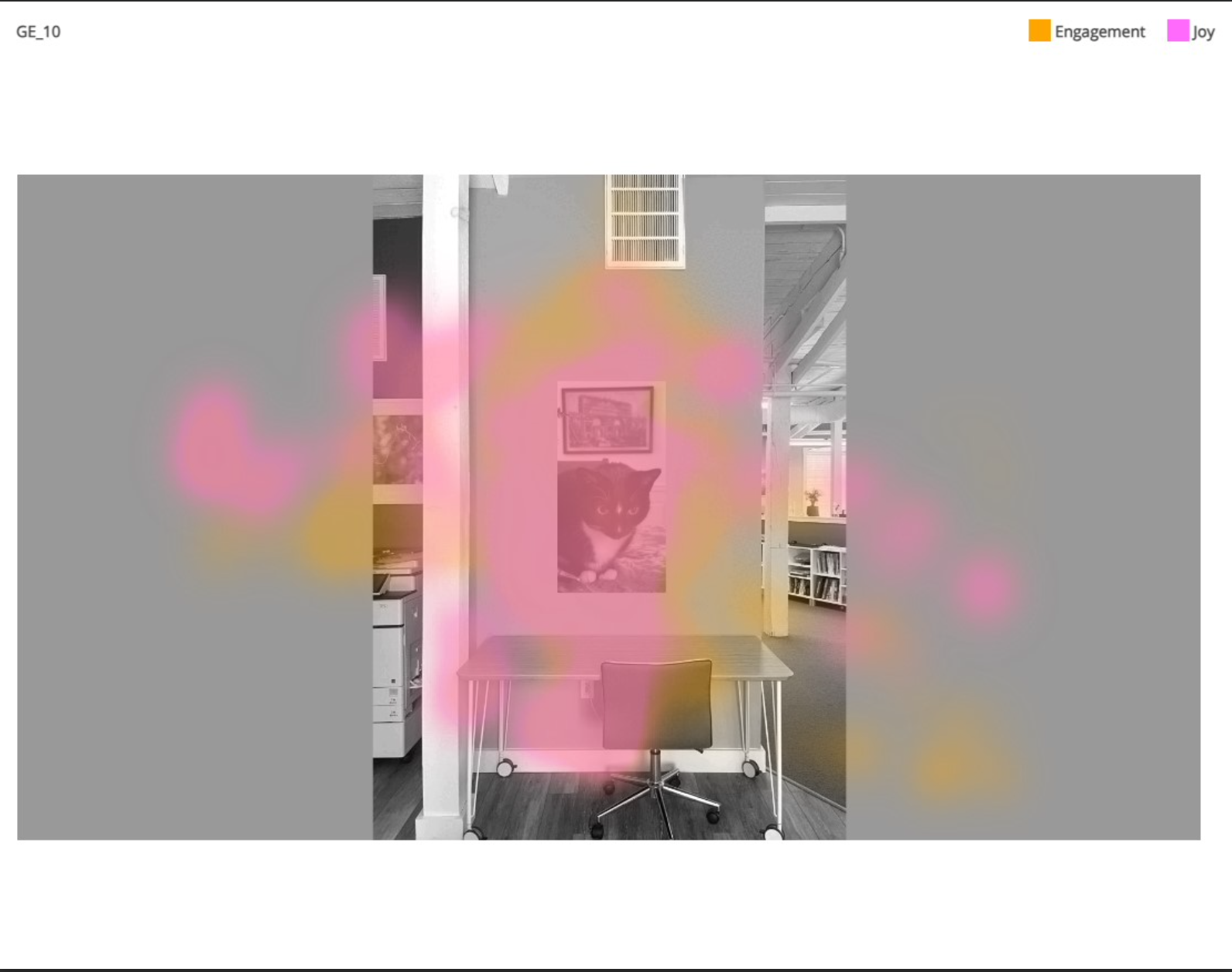
With the paired slides, showing the office before-and-after adding art, the bias to avoid blankness becomes more apparent:
Presented in a 12-second interval, participants gaze focused on the office with the art, effectively ignoring the office at the left, without it. Note how the heatmap glows reddest at the center of the painting, and there is more green overlay here as well, indicating how the space attracts more attention generally.
Art by Lola Chaisson
We found similar results above and throughout the study (see more results below); the art attracting the most views and drawing attention to the area around it.
Why does this matter? What people see in an office influences their behavior – faster than we may realize. People are more likely to head towards a place that attracts them and makes them feel good.
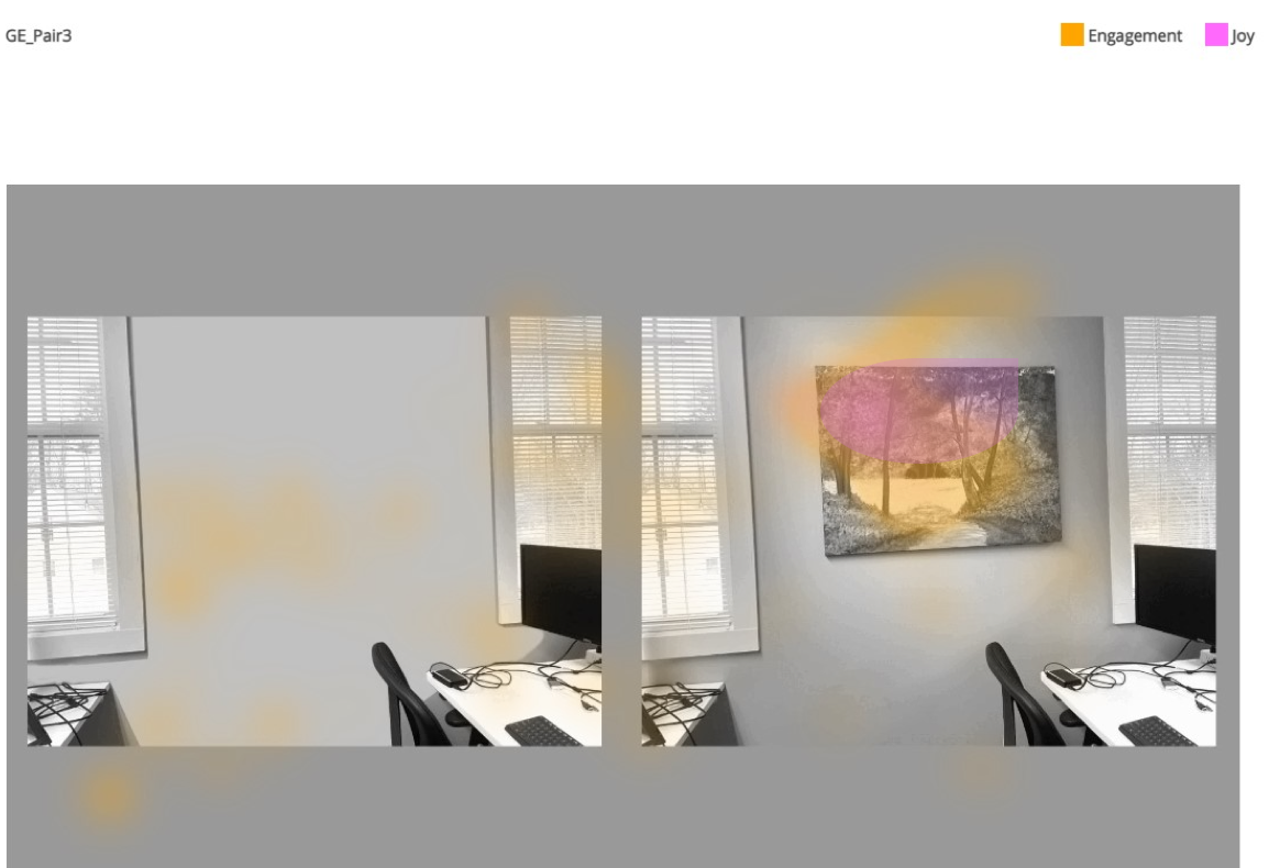
And here’s where biometric tools become even more useful; combined with facial expression analysis software eye-tracking studies can create emotional heatmaps, which indicate how people feel as they take in their surroundings. Did looking at the art make them smile – or frown?
The sample ’emotional heatmap’ above indicates, with a yellow hue, where viewers most engaged with the paired image, and with a pink hue, where they expressed joy! Note how the pink hue only shows up on the painting, indicating where they smiled – and not at all in the office space without the art!
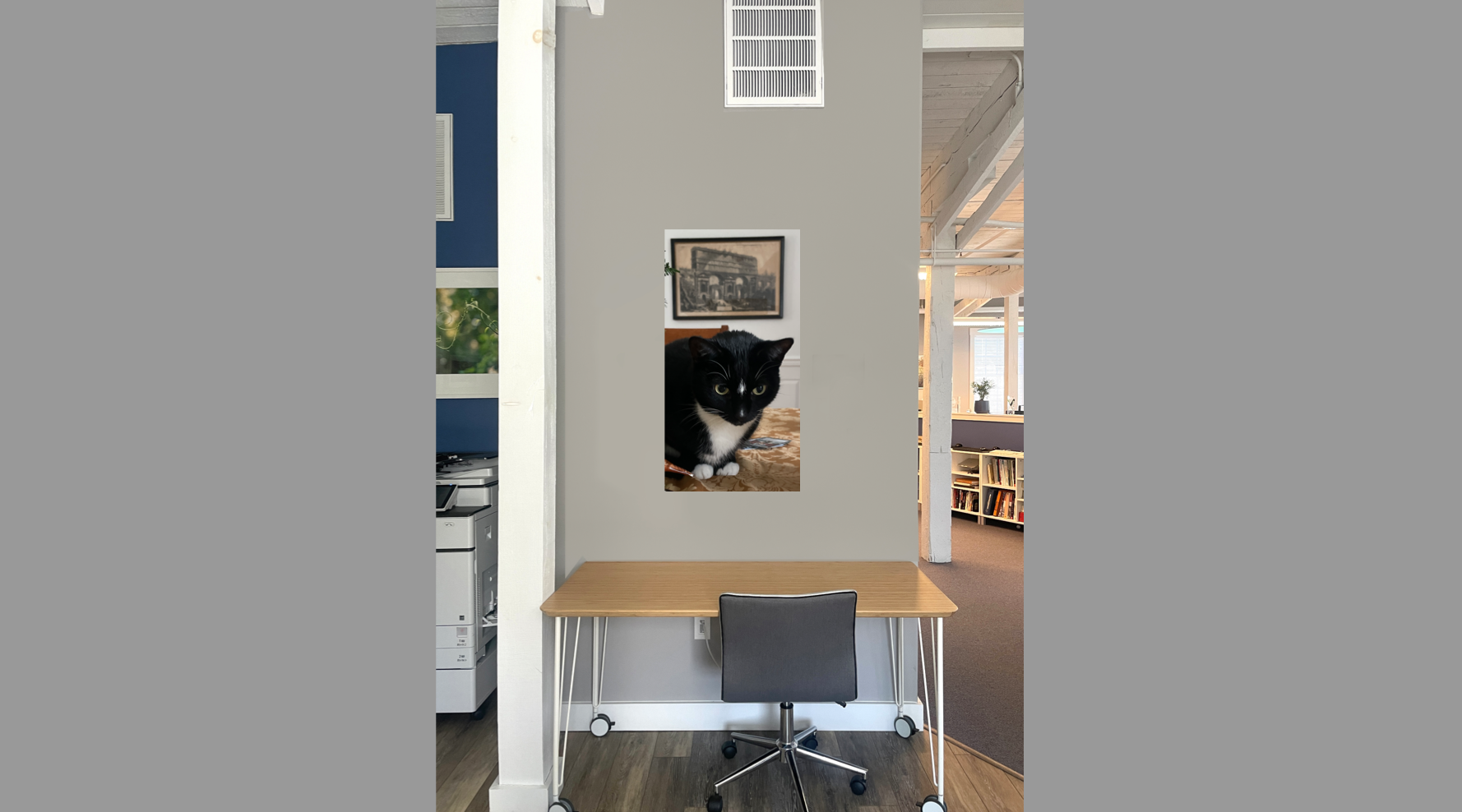
And what happens if viewers see an image of a cat?
Check out the joy map:
And note its absence, below, when the space is blank; there is engagement here, shown in yellow, but no pink indicating joy:
Feelings matter, and documenting how quickly they occur can be a powerful tool in the designer toolkit. They contribute to our health and wellbeing; so it’s time to acknowledge that and look at our emotions – both inside and out!
Additional results from eye-tracking an office, with the original paired slides, showing before-and-after art installation; and the heatmaps indicating how the art changed attention and engagement with the space.
Photographs by Suzanne Revy
Photograph by Suzanne Revy
For more information about this eye-tracking study, or others, email: contact(at)theHapi.org.
Based on the book Cognitive Architecture, 2nd ed, the Certification course reviews key findings in psychology and biology that help us understand the human experience of the built environment. Topics covered include:
Key Learning Objectives are to:
Understand the importance of the human ‘unconscious’ in our perception of architecture & design;
See how biometric modeling, including eye tracking, can be used as a tool to assess design by revealing unconscious experience;
Appreciate the extent the human brain is oriented to visual processing, geared to take in faces both human and inanimate, and why this matters;
Learn how evolution presets our perceptual biases because they offered survival advantages.
Courses run 1/2 hour each and provide AIA Learning Unit credit (0.5 per course); the first five courses are $25 each; the last two, introducing biometrics to participants, Class 6 and 7, are free. When all seven courses are completed, participants become ‘HAPI Certified‘.
The course provider, the Human Architecture + Planning Institute (theHapi.org), is a non-profit dedicated to understanding the human experience of the built environment and improving its design through education + research.
Feel free to reach out to contact(at)theHapi.org if you have any questions – and remember:
The study is out for analysis; we should have results out soon! And thanks to all participants who took part!
– – –
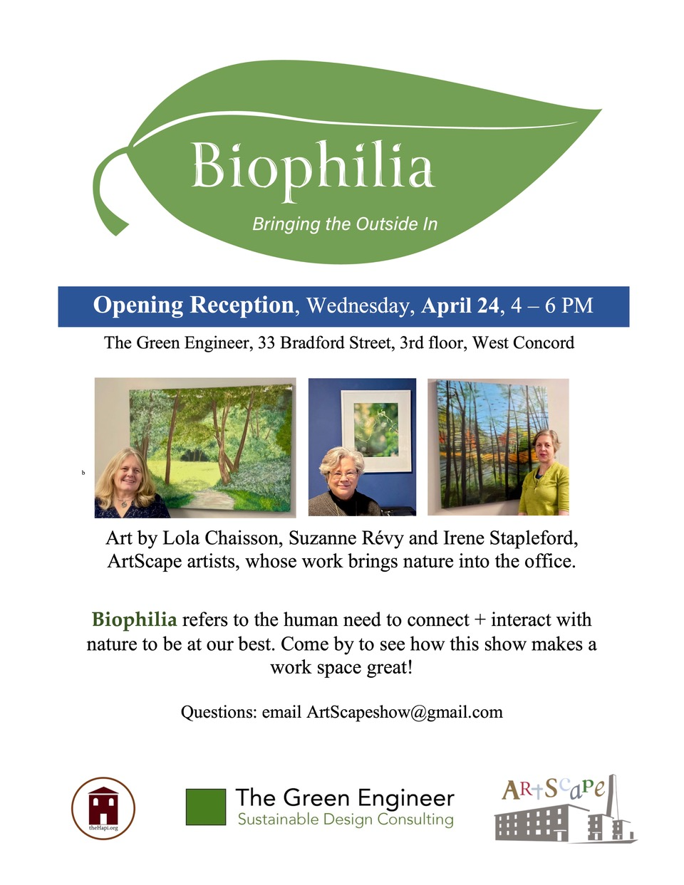
Biophilia refers to the human need to connect and interact with nature to be at our best. Volunteers were able to take part in this biometric study to explore how adding biophilic art changes the office experience. Anyone with a laptop or computer with a webcam could take part in this online eye-tracking study; it took about 5 minutes to do, including uploading the data collected.
If you have questions, or are curious to learn more, reach out to the Human Architecture + Planning Institute (theHapi.org), the nonprofit sponsoring this research, at contact(at)theHapi.org.
A recent article about the Biophilia Show, out in the local paper, The Concord Bridge, is reprinted here:
Biophilia” showcases how images of nature can transform interior spaces like The Green Engineer office in Bradford Mill. Photo by Chris Randall
In West Concord, bringing the outside in to boost office well-being
April 16, 2024
By Chris Randall — Correspondent
Studies on human activity patterns show we spend 90% of our lives indoors. Yet research shows that spending time outdoors improves our physical and mental well-being.
Two firms and an art group based at the Bradford Mill in West Concord are exploring ways to enhance indoor spaces by bringing the outside in.
The concept of biophilia — that humans have an innate tendency to seek connections with nature — was first used by sociologist and psychoanalyst Erich Fromm in his 1973 book, “The Anatomy of Human Destructiveness,” and later popularized in a 1984 book, “Biophilia,” by biologist Edward O. Wilson.
As design, materials science, and environmental psychology have advanced, there’s been an emphasis on bringing the outdoors into built environments in both noticeable and indirect ways.
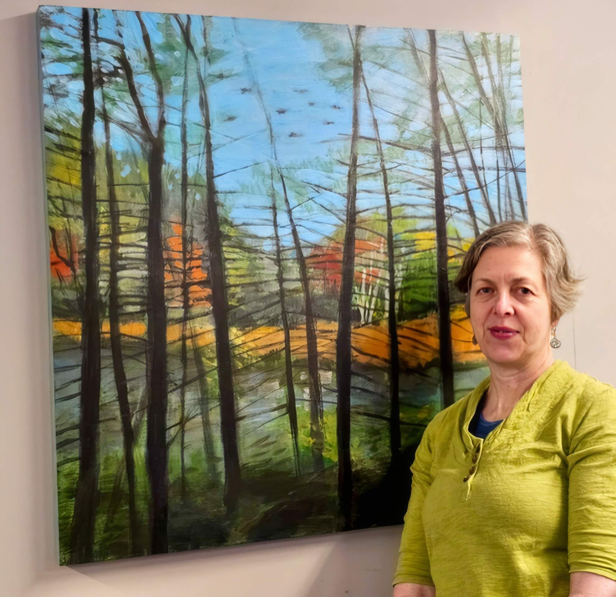
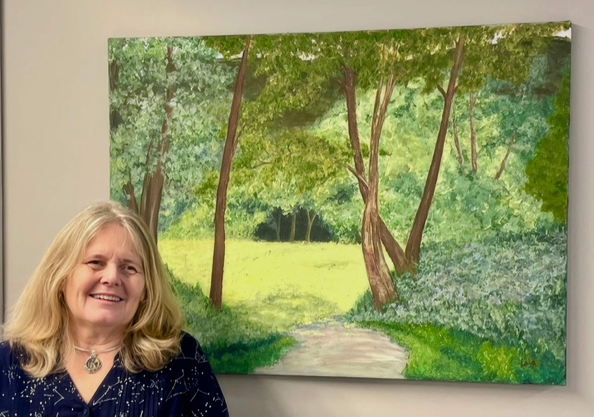
“Biophilia,” an installation that illustrates how biophilic art enhances interior spaces, opens at the offices of The Green Engineer (TGE) on April 24. It features works by ArtScape photographer Suzanne Revy and painters Irene Stapleford and Lola Chaisson.
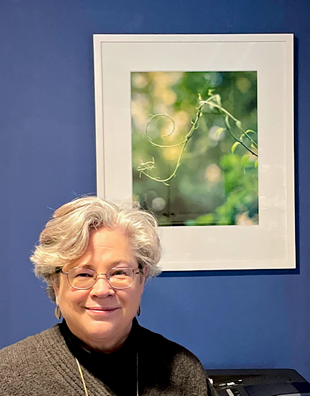
Irene Stapleford. Photo courtesy of ArtScape
Nature’s effects
The non-profit Human Architecture and Planning Institute (theHAPI.org), also in the Bradford Mill, will partner in the project, providing a way to let users know how they were affected by seeing images of the natural world in an indoor space.
TGE services include determining how energy efficient a building is, planning ways to lessen a building or industry’s carbon footprint, and assisting property owners in obtaining certifications for efficient energy use, environmental design, and health and well-being.
“We wanted to walk the talk,” said TGE’s Senior Sustainability Consultant Michael Munn, referring to two dozen paintings and photographs —scenes of forests, rivers, and countrysides — that just went up in its office.
Employee-owned TGE has teamed with building-mate ArtScape “to explore ways to incorporate representations of nature into our space through patterns, art, and indoor plantings,” Munn said.
Lola Chaisson. Photo courtesy of ArtScape
ArtScape is “a vibrant community of artists, many of whom draw their inspiration from nature and are passionate about the role of art in connecting people to nature and place,” said Director Ann Sussman.
The partnership “goes one step further,” Munn said: “Displaying biophilic elements was a start, but there was an opportunity to support an important local community of artists.”
TGE is leasing ArtScape pieces on an annual basis, effectively serving “as both a connection to nature via the artwork and a connection to place by supporting local community members.”
Feedback from TGE employees has been positive. “When I look at the photograph of a woodland river right above my computer screen, I can feel my stress level drop,” one said.
Try it at home
The exhibit has a related, high-tech twist that visitors can try at home: To test the idea that people are affected by spaces with a connection to nature, HAPI employs eye-tracking software, doing biometric assessments of how they respond to their surroundings
People accessed a web link that recorded how they reacted to images in the TGE office space before and after the art exhibit, using a computer’s camera. (No individual data was released, so privacy is ensured.)
Suzanne Révy. Photo courtesy of ArtScape
Besides examining the premise behind biophilia, the study showcases technology used commercially to analyze client experience and promote consumption. “The pivot the HAPI is making here,” Sussman notes, “is that we’re using the software to promote well-being.”
We’re thrilled to launch the HAPI Podcast as part of the Human Architecture + Planning Institute’s nonprofit mission to improve the design of our built environment through education and research
Hosted by Jo Riddle, the HAPI Podcast “brings urban design, biometric research, and interdisciplinary experts together to create a “HAPI-er” world,” she explains. A multi-talented, audio-visual producer, Jo is also an urban planning grad student at Tufts who has a passion for human-centered design.
In Episode 1, above, Jo speaks with Abigail Sekely, Executive Director of theHapi.org, about the importance of bridging disciplines to better understand design impact; Abigail also describes her personal journey, how childhood curiosity and college connections led her to this emerging field.
Stay tuned: new HAPI podcasts will be released the first Saturday of every month.
Have a question or idea for the show? Reach out to Jo at jo(at)theHapi.org.
We are always looking for collaborators and keen to work with the curious!
Never miss an episode! Turn on notifications for the HAPI Podcast and subscribe on Spotify here.